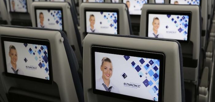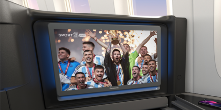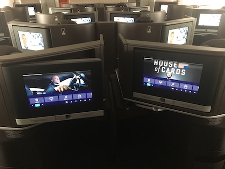
I want every passenger’s jaw to drop when they touch the screen and discover the entertainment system, That’s how I began my first meeting with the talented Global Eagle Creative company that we chose to design the entertainment system interface on El Al’s new Dreamliner aircraft.
As soon as El Al decided to purchase the Panasonic eX3 system, I knew there wasn’t much time and we had to begin designing the GUI (Graphic User Interface). It is a complex process, with hundreds of items, which takes a long time to complete.
Four partners are involved in this complex project: El Al, Global Eagle Creative, Panasonic Avionics and Akila (the company that integrated the interface into the system).
The key to the success of the project was understanding each of the roles and integrating them into the project, while adhering to a tight schedule and coordinating the parties.
Nothing left to chance
We did not leave a single detail to chance, from determining the size of the screens to deciding on the amount of content. We wanted an optimal viewing experience, with large touchscreens, but if the screens were too big, they would impair viewing quality. We did research to determine the most suitable screen sizes for the distance between the passenger and the screen. We requested and received accurate data from the seat manufacturers, and the results were amazingly accurate.
We also researched the optimal quantity of content to offer so that passengers would not get lost and waste half the flight just trying to find what they want to watch.
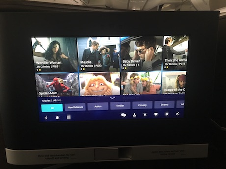
We checked what various other airlines offer using with the same system, in order to match the competition and meet the expectations of passengers. We also took into consideration that Israeli passengers have slightly different standards from passengers in other countries. For example, other airlines offer an average of four-to-six episodes in a series. We decided that for Israeli series, entire seasons would be included, with more than 10 episodes.
We could have taken an off-the-shelf interface, but I didn’t want to use one with a similar or identical design to systems on other airlines.
I wanted to create a unique interface, contemporary and innovative, which would give passengers a user experience close to what they enjoy at home – with a large touchscreen for easy surfing by gently gliding the fingers over the screen, enabling an immense variety of content and applications similar to what is offered on VOD systems at home or on a tablet.
Super-modern and accessible to all
Global Eagle Creative understood immediately what I was after, and very quickly we reached an initial design concept that everyone liked and upon which it was possible to build the entire design structure.
The critical and most significant stage in the process was deciding on the categories and subcategories. You need many hours of VOD and media systems experience to know and understand the user’s logic so that the experience will be easy, simple, quick and enjoyable.
On one hand, we wanted a super-modern system, and on the other, it had to be equally accessible to children aged four and adults aged 84, and every age in between. Our passengers are not a homogenous group, but the system must serve them all.
The basis is a given: films, TV, music, games, etc. But if the plan is to enrich these categories with a wide variety of content, we must subdivide these categories (genres) so that users can find the relevant content quickly and conveniently.
The skeleton of the user interface will be constructed according to determined categories. There is no place here for errors as the design will be fitted onto the skeleton and every error or incorrect determination will have repercussions all along the way.
Entering the destination experience
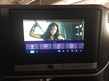
The idea was that with the very first touch of the screen, passengers would enter the experience of the trip or journey they were embarking on. So, immediately upon entering the system a stylized video appears that describes a typical site at the passenger’s destination. We went through hundreds of video segments from various sites around the world to find the right frames to make the passengers feel that they are traveling to one of the most beautiful destinations in the world, no matter what the reason for their travel.
At this point, the passenger selects the language for the system menu from 14 available options.
The main idea of this system is to encourage users to surf the system and become familiarized with it and its options, and at the same time, to assist them in choosing attractive and/or recommended content. The central element in the interface design is the background composed of pictures, which changes every 10 seconds, based on scenes taken from the films and the content that is embedded in the system.
While surfing the various categories, if a background scene arouses the passengers’ curiosity, they can tap it and immediately reach the relevant movie or program from which the scene was taken.
The correct selection of scenes and determination of the quantity and mix of the pictures emphasize the rich and varied content that is available, exposing passengers to the diverse options offered by the system and assisting in the selection of content to view.
Two special categories
We chose to isolate two categories of two different audiences, both of which prefer to enter directly into their designated categories: children and ultra-orthodox viewers.
These two audiences, each for their own reasons, prefer to enter their designated categories directly rather than search the various categories, such as movies, television, etc.
The ultra-orthodox audience does not watch movies and TV programs (for some this is forbidden by their rabbis) and they prefer to watch or listen to lectures or specific music, which we uploaded for them under the ‘Tradition’ category.
For children, in addition to giving parents the option of controlling content, we created a separate category that brings them straight into a rich, diversified and colorful world, with content that is meant for all ages, including an interactive map showing the flight route that has been adapted for children. Children can follow the illustrated map, read information about the countries and cities, see characteristic animals of each country and play with them by touching the screen, in addition to many other activities.
Adults also have a 3D interactive Flightpath map that passes the time during a flight.
The map application is no longer limited to information about the location of the aircraft and duration of the flight. It also offers an interactive experience in which passengers can choose the observation angle of the flight from within and outside the aircraft, including the cockpit, and it provides extensive colorful stylized information about the flight destinations and main tourism sites, ncluding detailed, accurate ways to reach them, with Google Map accuracy.
Chats on the aircraft
When I was asked why we needed ‘chats’ on the aircraft, I answered that the passenger cabin on the plane is ideal for creating a social network, and I didn’t mean for the purpose of meeting people – though that is also a possibility – but rather to connect passengers on a similar trip or with similar travel needs, such as finding people to share a taxi from the airport to the city or recommendations of restaurants, sites and attractions.
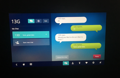
On another entertainment system that we developed, we saw that chats were very popular among passengers. It wasn’t really clear what to do with the chat function or for what purpose it served, and we came to understand that the passengers had to be directed via chat rooms and designated forums.
Paperless flights
Changing passengers’ habits is not a simple task and sometimes it is not possible; what is certain is that it takes time, especially when it comes to reading habits.
The decision in principle was for a ‘paperless flight’, and to this end we integrated the AirRead application, which offers newspapers, magazines and books and reading from the screen within the entertainment system.
The success of this change is due to the user-friendly system, which enables convenient leafing through pages and reading from a good quality screen to provide a reading experience that is even better than the traditional type of reading. It’s all a matter of habit…
On the operational side, emphasis was placed on the option of updating the system on a daily basis, ensuring current newspaper content.
Of course, this also means a saving in weight and money for the airline, as well as a significant improvement in service to every passenger, who now receive a richer and more varied choice of reading material than was available before.
Planning options for use of the system is a long-term project. From my experience, it is preferable not to provide all of the options and apps when launching the system.
It is better to introduce these features gradually, and this is what we have done. In the first stage we provided basic – though extensive – options: video and audio content, games, reading material and one or two applications. At this stage we confirmed that all functions were working properly and all bugs have been ironed out.
Now it’s time to move to the second stage and include more complex applications, such as those that enable sales and payments through the system, live TV channel viewing, including advertisements, personalization and many more diverse options that we are working on now.


