Think back to the last time you looked at a car in a showroom. The styling and the relevant numbers would have attracted you to the model, but when you stepped inside, what did you do? Instinctively everyone wants to get a feel for the quality and engineering of the product, so they stroke and tap surfaces, press buttons and try the soft-close features. We often trust our hands more than our eyes – indeed the first sense we develop, at the prenatal stage, is touch. Therefore we want to confirm that that lovely, solid-looking object also pleases the tactile senses. So what works in an aircraft interior when you need to convey comfort, depth of engineering, safety and luxury – all while accommodating weight constraints?
“It’s a super-interesting topic. I think it is what will set airlines apart in the future. Tactility and the experience of quality is vitally important and will be the key that will set you apart for a quality experience in the future,” comments Magnus Aspegren, director of creative consulting at BMW DesignworksUSA’s Shanghai studio.
Indeed touch has been key in Aspegren’s latest projects, which include Airbus, Samsung and Singapore Airlines’ first class. For the latter, Aspegren says the touch elements were “extremely important and key. We wanted to create a tactile experience whereby wherever you put your arm down or your fingers landed, those areas would have a very satisfying tactile experience, so you have that communication when you’re sitting. When you open a compartment it should have a certain weight in its movement that really communicates quality. That is extremely important. You have to sit down and build the scenario of how somebody would use the seat and use an environment like this and make sure you create the proper responses along the way.”
Back to basics
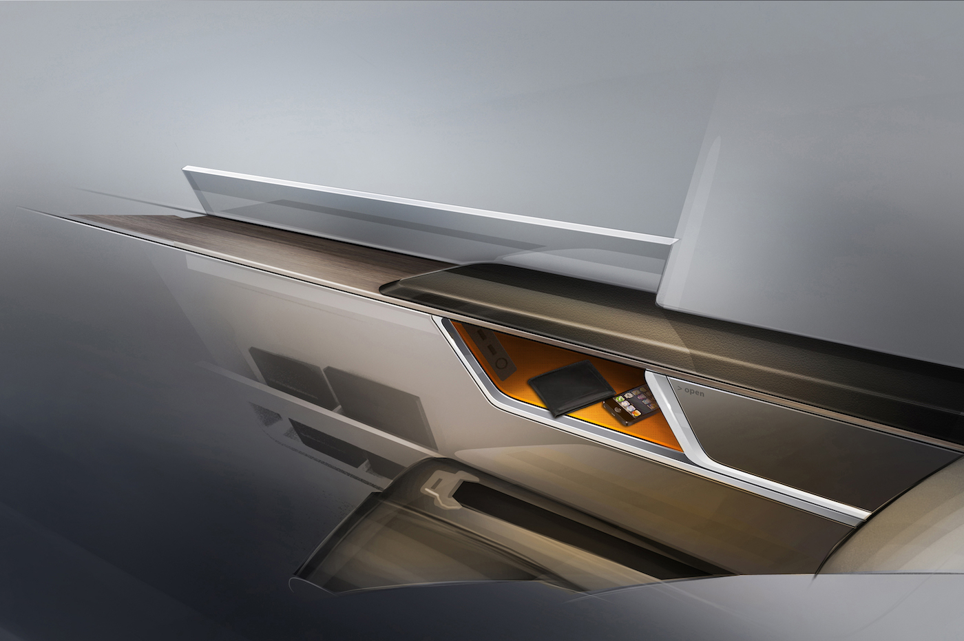
A quality feel is key to the onboard tactile experience, the very foundation. As Aspegren says, “Features are nice and features are good, but you can go too far with them sometimes. I think if you’re really looking for quality, then after a while features don’t really bring it. It comes more from the sense that something is solid and is made from quality materials and has some weight to it.”
One of the most disappointing sensations for Aspegren is when a material’s tactile response is not correct for what is intended to be a high standard of product. “One thing I really have a problem with is when I’m sitting in a really nice seat and then I open a compartment and it’s very flimsy. That really doesn’t give me a sense of confidence and comfort. A genuine experience is the best.”
Paul Priestman, director of PriestmanGoode, agrees, adding, “You want a sense of solidity.” Other key factors for Priestman are the temperatures of materials – you don’t want to put your bare arm on a cold piece of aluminium.
Another hands-on designer is Richard Stevens, founder of the Forpeople design agency, and also creative director at British Airways, who says that the tactile experience “is really, really important.”
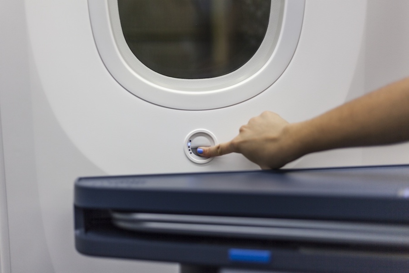
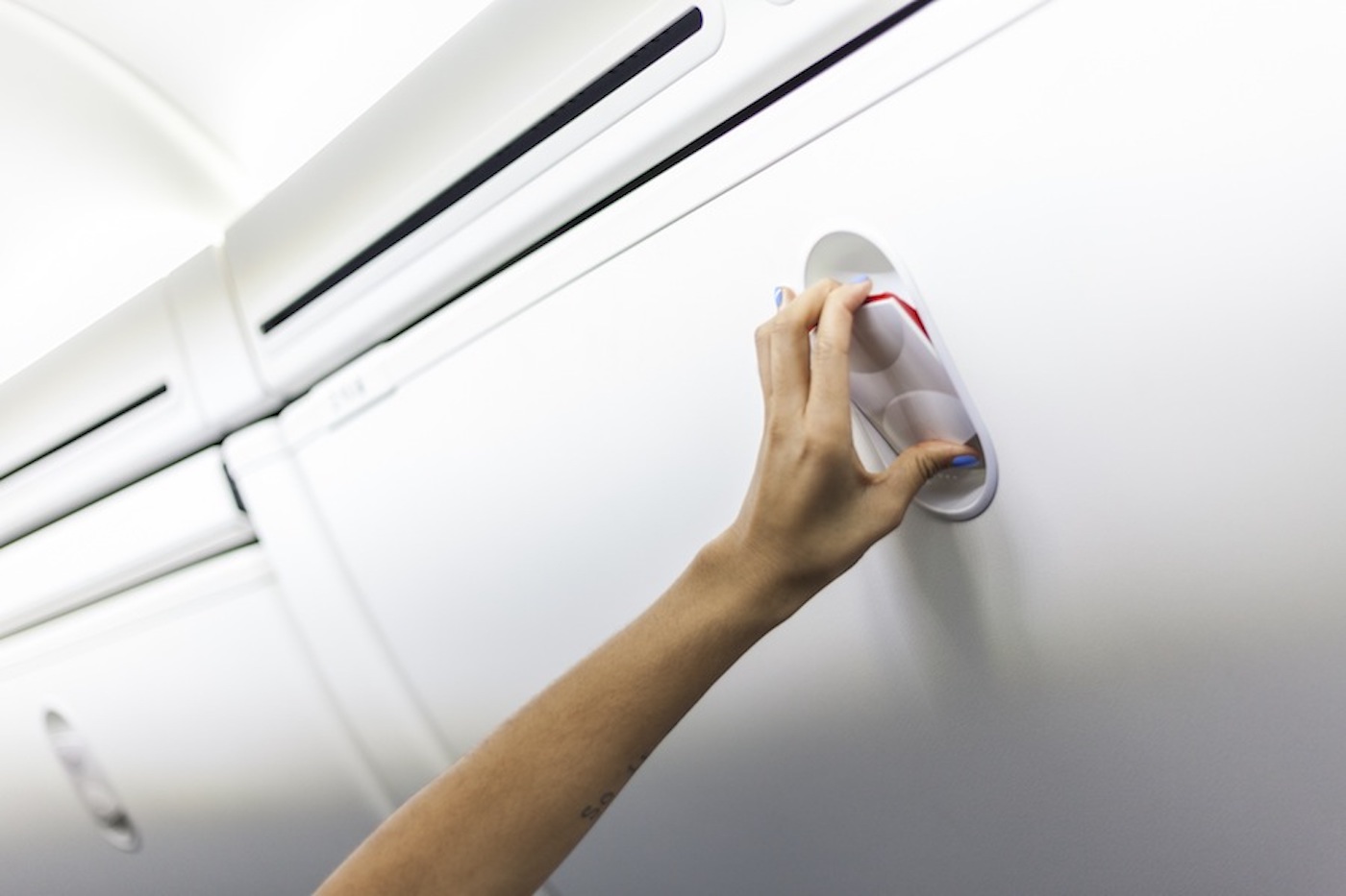
Stevens says one element that is touched for hours at a time, but is little considered, is the floor. When he worked as a designer at Ingeni – a Ford-owned multidisciplinary design studio that is sadly no more – he was brought in by Boeing, together with Teague, on a year-long project looking at touchpoints on the Boeing 787, such as the dimmable windows and stowage bin operation.
“One of the insights we discovered was that no one considered the floor as a touchpoint. Many people on a flight take off their shoes and connect constantly with the floor, so just that insight is a key touchpoint in delivering a feeling of quality and we need to design every element of that,” says Stevens.
Material matters
So what materials are pleasing to touch? “The aviation industry is interesting,” Aspegren feels. “Because your material choices are limited, you constantly have to save weight, and there are fire and smoke issues. We choose materials such as a durable and lightweight Tedlar for shells, held in place with real aluminium trim, so that you can feel that it really is metal. When you walk in and touch the edge of the seat and find it’s real metal, you really get the sense of quality. The metal gives a temperature communication that is very satisfying. We also use some surfaces that look like wood. It’s not always possible to use real wood in a commercial airliner, but it’s important that when you look at materials and what they communicate to you, you want them to stay close, both from a tactile and a visual point of view, to being true to their nature. We’re trying to really be more correct in our interpretations of materials.”
Howard Sullivan, director of the YourStudio spatial design agency in London, which works with airlines including Cathay Pacific, Iberia and British Airways, states, “Ideally you want the interior to feel as good as a really good car interior like an Aston Martin. It’s harder to use real wood veneers in aircraft though, so it’s sometimes more smoke and mirrors. I have a bugbear about fake materials – if you’re going to use wood, use wood. If you’re not going to use wood, don’t pretend. Try to keep things simple, clear and uncomplicated. Anything that risks seeming gimmicky or fussily designed risks seeming fanciful or silly, when you want people to feel calm. If you can give someone a memory of different touch sensations, that’s an amazing thing to do. It’s kind of answering the emotional needs of humans, allowing them to explore their senses and be stimulated onboard.”
Someone who works closely with materials trends, CMF, and high-specification textiles and surfaces for the transportation and consumer industries, is Emma Rickards, principal at West6, who has worked with the likes of British Airways, Panasonic, Virgin Atlantic and Hyundai. Rickards is happy with the increasing quality of product being supplied to the industry, mixing pleasing feel with safety requirements. “There’s nothing I feel is seriously lacking. The fibres have all moved on,” she states. “All the mills are now capable of producing lustre and softness while meeting industry requirements. The days of harsh heavy-duty fabrics are long gone.”
So what new materials does Rickards think could enhance the feeling of touch? “Rubbery materials have a supple softness and a low level of sheen – what I would call ‘shine-off’ rather than gloss. There is still a place for gloss but in small quantities,” she says. “Neoprene and other man-made fabrics have a lovely quality where you can lose yourself in the surface. It’s all about knowing what it’s going to feel like before you touch it.
“In terms of leather, I’d use something that doesn’t feel too shiny and therefore slippery. The latest leather touches I saw at the Milan Furniture Fair were a clay-like leather that is very light absorbent with no slick sheen and looks almost velvety. Your fingertips know what it will feel like before you touch it. If an aviation leather specialist could make a product look like that and perform on an aircraft I’d be really interested in using it.”
Good value
This all sounds luxurious, but delivering a rewarding tactile experience doesn’t necessarily mean a lot of additional expense. Consider the very thin and light cabin materials that are essential for reducing aircraft weight, but in themselves don’t have the heft that implies quality and solidity when touched.
Priestman is a fan of simple, low-cost ways to really enhance the quality feel, such as soft-action lids and levers, and material deadening. To make a thin, hollow surface feel more substantial, he suggests giving such materials some rigidity around the edges so that they don’t flex as much, perhaps backing them with foam and ensuring that they don’t resonate against any neighbouring surfaces. “Aircraft are sound boxes that really resonate rattles and squeaks by the nature of the cabin shape,” he says.
“We designed some cosmetics packaging for No7 and the compacts had a damper so that they opened slowly when the button was pressed and didn’t twang. The damper cost a fraction of a cent but gave the product a great feeling of quality. If you can do that on a £1.99 product then we should see it in aircraft,” adds Priestman. “Aircraft are amazing machines, and to have a floppy bit of plastic on your armrest doesn’t give you a great sense of security. But then you do want it to be light.”
Another view is given by Sullivan, who suggests that any expensive materials chosen for their joy of touch can be used selectively. “In flight everything must feel solid,” he says, but adds that this is only key for the main touchpoints. “For example, an interior designer in LA once told me that, when specifying a showhome, you should make sure that everything people might touch, like the handles and taps, is really expensive. No one will look at the kitchen carcasses.”
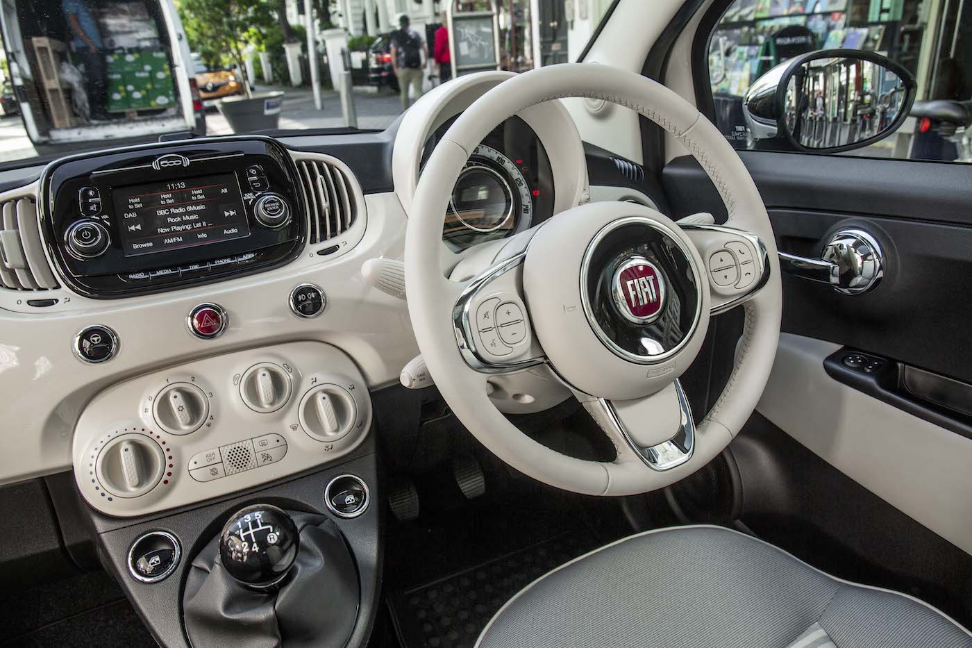
Richard Stevens adds that the airline tactile experience can perhaps be a little less intensive than that of the automotive world. “The automotive industry is an interrogator and deliverer of the very best haptic qualities. But with the airline experience you don’t necessarily need to go to the same level of quality because you’re not interrogating those details quite as much, because you have the service as an overlay over the experience. So there’s more of a balance that can be offset between product and service, whereas in the auto world it’s all about the product you’re engaging with. There is still no excuse not to focus on it, but its something to bear in mind.”
Pressing issues
The items we really engage with onboard are the controls, with each button, switch and control surface giving us subliminal impressions of the quality of engineering in the environment. But what is the correct feel for the action? Should the controls be soft, or operate with cold, metallic precision?
Rickards states that getting the action of controls right is absolutely key and requires great attention to detail. The knob itself, its function and its placement need to be intuitive, and then decisions need to be made about whether the button or switch should be metal or plastic, or whether it should have a bezel to give it an extra bit of detail and an extra treat for the fingers.
“It’s nice to get a little bit of definition or a little touch of detail or pattern into the moulding, just a little something individual for airlines that specify their own knobs,” she states. “The buttons and controls could surprise and delight you and not just be functional or too technical. Functional simplicity, especially if it’s intuitive, has an awful lot to be said for it. It’s about getting the right degree of resistance, the feeling that the knobs and buttons will perform the function you want them to.”
Sullivan adds, “The joy of operating switches has become lost a bit nowadays. For example, most smartphones have only one button, which gives you no sensation of what it’s going to do when you press it. Loads of things are touchscreen now, but in the 1940s and 1950s, bakelite switches had more character. You should dare to have personality and engineer something special that’s a real joy to use. Technology has advanced and there will be a lot of new technology on board over the coming years, so it’s nice to think about counterbalancing that with some other things that are still quite old fashioned.”
BMW’s Aspegren, meanwhile, enjoys a tactile feel that evokes precision engineering. “I think we should be honest that we’re in a machine, but not put fear into people – everything should feel reassuring. It would be inappropriate to create a Louis Quatorze feeling onboard. An aircraft is an amazing machine and I think we need to communicate that it’s still a transport environment. People are very responsive to that.
“Thus, when we design control panels we work carefully on what we want the tactile feel to be,” he adds. “For example, when you press the seat adjustment button it should give a really nice communicative click that provides the appropriate level of tactile response for the experience. You can definitely do this in aircraft. We work with switch samples with different tactile feedback, try them on mockups and choose the ideal solution.”
Priestman adds, “You have to design for practicality, and sometimes you want a clunky mechanical switch, sometimes something softer. You have to be intuitive as you’re trying to express a function.”
This is all very simple in theory, but Stevens finds it difficult to find just the right switching products for airline projects. “Suppliers to the commercial airline industry need to deliver the right haptic qualities, whether that’s latching, actuators or materials, at a level that is much higher than it is today. That’s probably one of the biggest battles we have with suppliers. In the automotive industry you can specify haptic qualities down to Newton forces, but they won’t sign up to that in this industry. That’s something I think will change, but it’s the most painful part of a programme. Other designers would say the same. At the moment it comes down to how much you’re willing to pay. There are different qualities of latches and so on, but they’re still not as good as you would expect.”
Smooth operator
Passengers are becoming increasingly accustomed to using touchscreens on their smartphones and tablets, but do they provide a satisfying touch sensation onboard? Our experts are not convinced, and don’t predict the simple pleasure of pressing a precisely damped button disappearing anytime soon.
Sullivan states, “Moving forward I think the world of products is really going to escalate in terms of touch because the whole Jonathan Ive pared-down minimal metal thing will lose its novelty and I think the next thing will be to surprise people a bit more and give them something that isn’t ubiquitous.”
Another fan of quality analogue pleasure is Priestman, who adds, “We’re all getting more used to using pieces of glass, but you get a lot more tactile feedback from the click of a button and it is also more intuitive. That’s one of my concerns. Is this direction making life better or worse? I think about the ageing demographic, and does glass exclude partially sighted or blind people? Some of the most popular products are designed for young people, and the demographics of the world are going the opposite way. It’s about designing something the right way, which is inclusive. I think having young designers designing for young people isn’t actually correct or responsible. With some touchscreen concepts now you can get some tactile feedback, but are we just getting caught up in a technology that isn’t as good as buttons?”
Rickards is in agreement: “My feeling is that old-fashioned actual sensorial elements in your hand will become more important as the technological side grows. Perhaps they’ll grow in a duality as I don’t think mankind likes to give up the fundamentals of colour, material and finish, and the surprise and delight it can give you when you get a wonderful sensation from touching something. It can have all sorts of roles, and comfort is one of them – it might be a reaction against everything being done on screen. Real values will spring up again.”
The Audi approach
Believe it or not, an entire 15-strong team at Audi spends its days pressing, tapping, pulling, sliding, turning, feeling and touching to give controls a specific operating feel and actuation sound, ease of movement, impressions that help define the way an Audi feels, and to ensure that feel is consistent across the model range.
With a full-time emphasis on haptics, the Team for Actuation Haptics, which was set up in 1995, has efficient processes and is involved from the initial concept drawing stage, contributing pre-defined haptic criteria with an aim of making something subjective a little more objective. The team also runs comparative tests using test persons from neutral organisations, and with universities with the aim of learning new scientific findings in the field of haptics, especially in the area of sensory perception. The haptics experts have used their research to develop technical specifications that suppliers are required to comply with, and which are amended with new scientific findings at regular intervals.
“The customer wants to have clear feedback when initiating a function, says Jörg Müller. co-coordinator of the team. “When the driver presses a button, for instance, the way in which the effort required increases is important. Haptic response also includes acoustic feedback, such as a clearly audible click. The proper combination of haptic and acoustic feedback gives the customer the confidence that the function was indeed initiated.”

This work primarily involves the force, process, movement, direction and sound of the controls. One particularly important question is whether the shape of the control element makes clear how the element is operated – what the team calls “operating logic” or “blind operation”.
Actuation haptics and operating acoustics are usually perceived subconsciously. “If the customer finds that every switch and lever in an Audi is in the right spot and the switches respond the way the customer intuitively expects them to, then we can be happy,” adds Müller.
It is not yet possible to determine from existing analyses whether there are different preferences between individual groups of customers, though the team has found that women make more marked haptic distinctions than men, and that in some markets customers are more tolerant of faults than in the home market of Germany.
Think you’d have a feel for it? The team consists of employees from a broad variety of specialised backgrounds within Audi, such as component development, controlling, quality assurance, design and marketing, in order to get a broad mix that might simulate a representative cross-section of customers. The team assesses controls according to the following criteria: ease of motion, moderate operating paths, defined end stops, precise guides, uniform actuation sound and clear feedback at the shifting point – primarily tactile feedback, but acoustic as well.
Getting a place on the team requires a few special qualities, according to Manfred Mittermeier, fellow team coordinator: “It’s important that you take haptics seriously. Another requirement is a high degree of sensitivity. Not so much a sensitivity based on physical characteristics such as the fingertips, but more to do with a process of awareness that happens in the mind. We measure, compare, analyse and discuss both the technical and design feasibility of new concepts with development engineers and suppliers.” Of course you can’t please every customer, but generally if the haptics please 80% of customers, it is considered a good result.
Feel-good factor
Our experts share the things that make them feel good because they feel good:
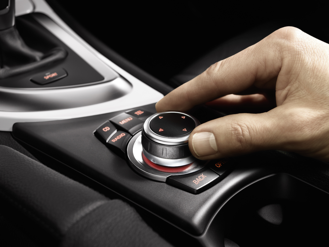
Magnus Aspegren, BMW DesignworksUSA Shanghai: “BMW’s iDrive is a piece of engineering you hold in your hand. When driving you often find your hand rests on the iDrive, and I find it a very successful product from that point of view. It could work on an aircraft – it just depends how much information you put in there.”
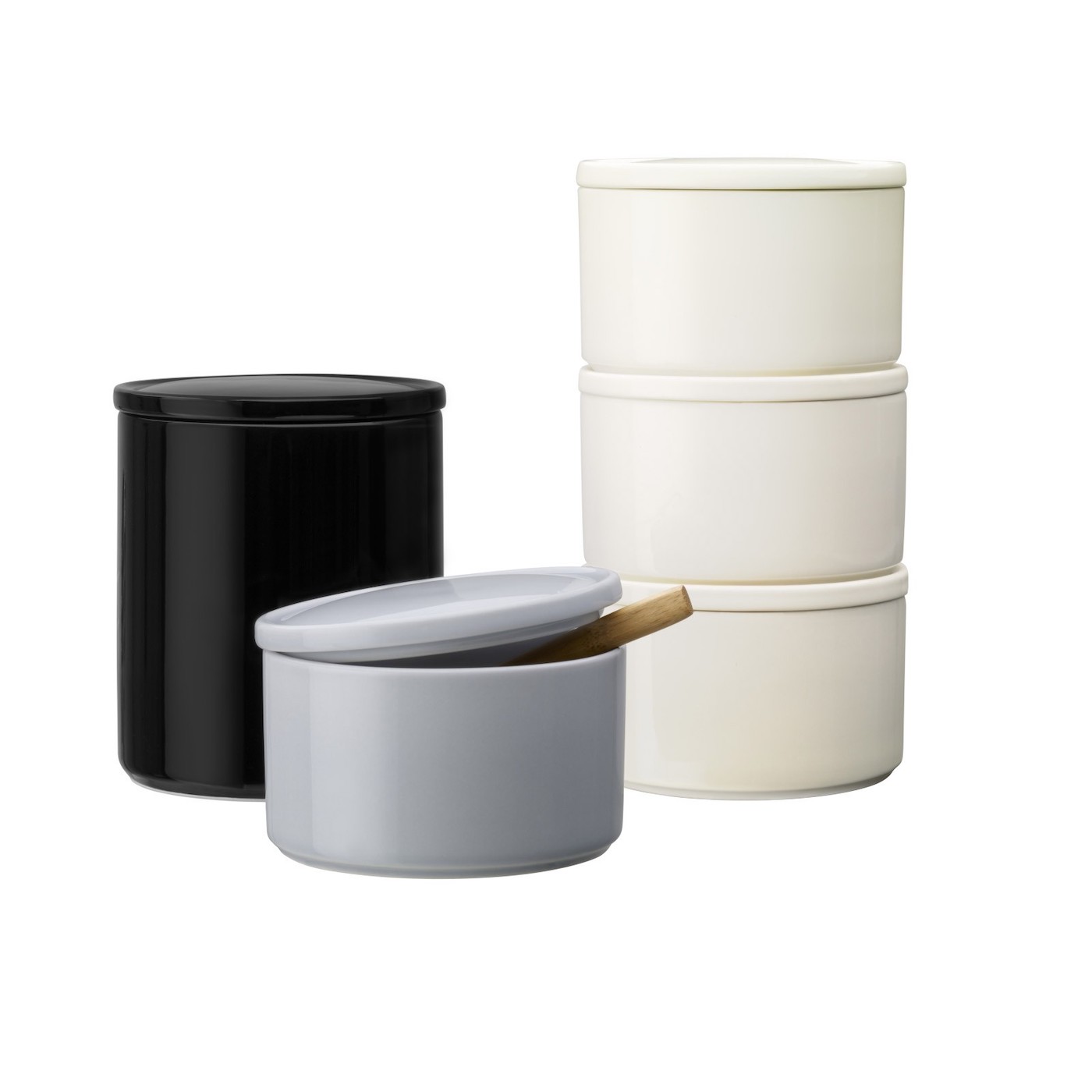
Emma Rickards, West 6: “Henry Moore’s sculptures. Kvadrat ‘Molly’ fabric by Asa Pärson: it is 100% simplicity and 100% textile. Skandium ‘rubber touch’ ceramic storage jars. The Living Proof shampoo bottle, which has a smooth matt surface with a dash of white gloss at the lid. And my Lainey Keogh knitted evening dress: it’s fabulously tactile and in a heavenly shade of moss green. When I wear it I feel as though I have been rolled in moss.”

Paul Priestman, PriestmanGoode: “Apart from Mrs Priestman – a car key. A lot of work goes into this object, which is embodiment of probably the second-most expensive thing you own and is all about touch and clicks. It will be interesting as these things disappear into apps or iris recognition, etc.
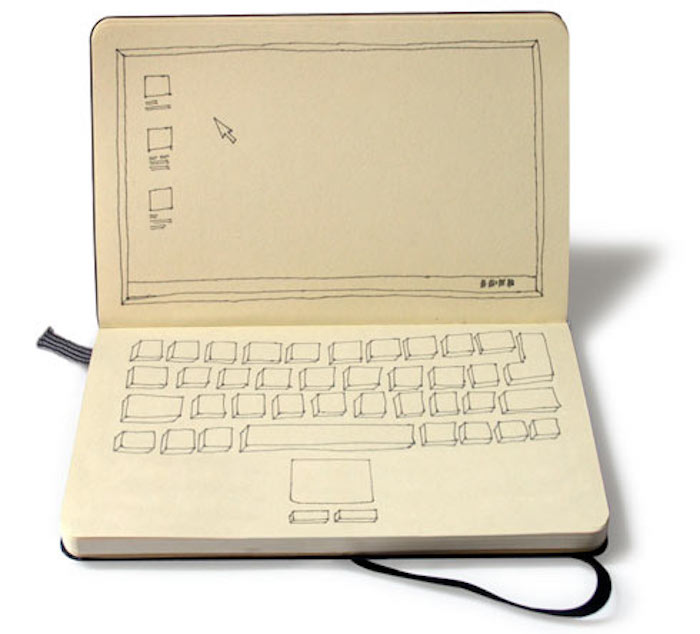
“Also my notebook. I had a digital diary and have gone back to a notebook, and I keep all my old notes. With digital devices you don’t have that. Being hounded by technology with emails, etc, I think we need to go back to having ‘me’ time.”
Howard Sullivan, YourStudio: “I love the feel of SLR cameras. The lenses have rings with knurled edges that you twist and they move against each other . They feel solid and expensive and well engineered.”

Editor’s favourite
Adam Gavine: I frequently hear designers saying how they strive to surprise and delight the passenger. I must admit I was both surprised and delighted when I turned the exquisitely formed knob, set to the side of the British Airways first-class seat, after I was attracted by its quality metallic finish, backlit in a vivid blue. Initially I thought it was a volume control for the IFE, and was enjoying its beautifully damped action. The surprise came when it turned out to be the seat actuation control. A lovely object and a joy to use, not just because of its feeling of precision and resistance, but in the way it simplifies a complex process.
The design, according to BA’s creative director, Richard Stevens, came from an insight following the launch of BA’s original lie-flat first-class seat. It seems that customers were hugely excited about being in the first lie-flat bed on an aircraft, but in a very British way they didn’t want to call over a crew member and draw attention to the fact that that they didn’t know how to operate the seat using the buttons. Generally passengers waited until a crew member came along to offer a drink before they asked.

So the design teams thought about the most simple interaction passengers could have with the seat, which would be a simple knob: turn it one way to go up, the other way to go down.
“Investing in that as a touchpoint was really important, explains Stevens. “Things like that come from really solid understanding and insight that drives the design. The idea wasn’t to have an amazing metal knob, it was to deliver a really intuitive experience.”


