Don’t think of the E2 interior concept as a mere evolution of Embraer’s E-Jet cabins – rather it is an all-new blueprint for the next-generation Embraer passenger experience. From the moment you step on board, you are immersed in an environment that has been designed to be uniquely Embraer, and to maintain and strengthen the Brazilian airframer’s strong position in the 70-130 seat narrow-body market.
The cabin design has been created over the past two years in a close partnership between Embraer’s in-house engineering team and the Priestmangoode design agency, with a brief for the E2 to achieve clear differentiation from its competitors. This really is a clean sheet approach, with everything from the sidewall panels, ceiling panels, overhead bins, PSUs, lighting, IFE, seating, galley and lavatory all conceived to enhance the passenger experience and make the E2 an efficient aircraft to maintain. Key to this second factor is that the entire cabin is modular, allowing for quick and low-cost reconfiguration – attractive qualities to the key customer demographic of banks and leasing companies.
As André Stein from Embraer’s commercial aviation market intelligence department explains, “We want E2 to be the benchmark for the next generation of narrow-body cabins. Priestmangoode brought design expertise and they know commercial aviation, and they joined forces with our engineering teams. There were a few drivers for the project, such as increasing personal space. We also wanted to have a more modular cabin, particularly as leasing companies are becoming more and more relevant in our market. Being able to play with different interiors without the burden of customization was a big deal for us.”
Personal service
A small but vital element of the swift reconfiguration capability is a reconsidering of PSU design. Whether you wish to add or remove premium seats, or alter economy seat pitch – perhaps to accommodate extra-legroom seats – the innovative PSU design makes the process simple, and gives each passenger in every class their own PSU directly overhead, complete with reading light, oxygen mask and air vent.
When seats are moved forward or backward for a cabin reconfiguration, engineers need only slide the PSUs – developed with Diehl – along a concealed rail into the optimal position and clip in an infill panel to restore the clean look overhead. It is clear to see that the styling of the air vent and its control wheel was inspired by automotive cockpit vents.
This approach to PSU design is the first of its kind, and in addition to its benefits for operators, it means passengers don’t have to reach into their neighbor’s personal space to use the units, enhancing the experience for every passenger on board, and giving them defined personal space.
As Daniel MacInnes, Priestmangoode’s project head for E2, explained during our tour of the cabin mock-up at Farnborough International Airshow, “The PSU is something we’re really keen on pushing and it makes it so easy to reconfigure the aircraft. You don’t have to move the stowage bins, as the PSUs move along a localized strip. It’s a key feature of the E2 cabin for me, more than anything else. The keenness of Embraer to try something new has been fantastic; they’re willing to push the boundaries of what they want from an aircraft.”
Thoughts from above
The idea of simple modification and maintenance was also carried through to the ceiling, which MacInnes describes as “a ‘wow feature'” in terms of both styling and function. The ceiling undoubtedly looks very cool – almost Tron-like with the mock-up’s LED lighting set to an electric blue – and the panels can be quickly pulled down to give maintenance crews easy access to electricals and pipes, and replaced just as easily once finished.
The team has been working with Zodiac Aerospace on the ceilings, and they have also strived to give the ceilings in the work areas a cleaner look than those of the first E-Jet. At the rear of the cabin, by the lavatory, where exit signs, work lights and speakers were scattered around the ceiling area in the E-Jet, they are now all integrated into a single ceiling pelmet for a cleaner aesthetic, with a technology strip that again eases access to electrical components and pipework.
Bin design
The clean surfaces of the ceiling are complemented by the overhead bin design, which blends with the ceiling pelmet to create a seamless integration between bin and ceiling for a cleaner, more spacious looking cabin as you enter the aircraft – whether the bins are open or closed. The effect is accentuated by the open design of the bin dividing walls, which extend the sightline down the cabin upon boarding. The effect really works, giving a surprisingly open, spacious and welcoming feel for a narrow-body aircraft.
More surprising is that while the bins look sleeker than the current E-Jet units, they actually have around 40% more capacity, without taking any extra cabin space. This means that every passenger can stow a typical airline carry-on bag (of IATA’s maximum recommended size of 22 x 18 x 10in). In the current E-jet bins, bags are typically stowed sideways, but in the new design, four bags can be stowed wheels-first in each bin.
Paul Priestman, director of Priestmangoode, is particularly proud of the stowages: “Integrating the bins into the ceiling is a big innovation. No one really thinks about it, but the first glimpse you get of an aircraft cabin is with the bins open. The biggest challenge of the project was that the fuselage couldn’t be made any bigger, while Embraer wanted bigger bins and the CEO said that a key part of the Embraer brand is in having a spacious cabin.”
Embraer, Priestmangoode and ZEO are currently halfway through the development program for the stowage bins and are confident the final design will be faithful to the mock-up.
The overall push for modularity is explained by Embraer’s Stein: “We got the designers together with our engineering team to make sure the cabin design was really functional and robust, and easy to maintain. The Embraer engineering team was involved from the beginning and they came up with some clever solutions to make access to the systems behind easier. Sometimes it’s easy to make something that looks good, but this cabin combines form and function. The main drivers were increasing personal space and stowage space, without compromising cabin space. That was a big challenge, but we managed to do it and came up with some very clever solutions to make better use of the space. Our engineers came up with good solutions behind what you see, to make sure all the systems are updated and maximize the use of the space.”
Premium class
In keeping with the flexible theme of the E2, the cabin can be configured to include any combination of economy, economy plus, or a premium class. For the latter, Priestmangoode has developed two options with California-based Aero Seating Technologies (AST), a company in which Embraer is a shareholder, and which already supplies seats for Embraer’s Lineage business jet. The first option is a 2-1 configuration with ‘lazyboy’ recliners, a layout that will be familiar to current E-Jet flyers. The big difference is that the E2 cabin does not require any bin modifications on the single side, thus maintaining the clean and consistent appearance.
The second option is something rather different: a staggered configuration that adds a really modern, upscale appearance to the narrow-body premium experience – as well as a 50in seat pitch. The seats have been designed as a fully optionable product to offer airlines great flexibility to put their stamp on the cabin without requiring extensive customization – think personalization rather than customization. Options available to staggered seat customers include a one-piece table, a pull-out drawer for a laptop, and a leg rest.
The stagger also strenghtens the premium feel by giving an enhanced sense of space and privacy, more space around the shoulder area, easier aisle access for window passengers, and cleaner sightlines. A curiosity is the large box found next to the rear seats: at first glance it may appear to be a bonus surface area for those seats, but in fact it is used to stow equipment that may be required on some routes, such as a jungle survival kit or an extra life raft. The space is perfect for stowing such equipment without using valuable overhead stowage space.
Even better, whether you select a 2-1 or staggered layout, the premium seats are mounted on the same seat tracks as in economy, which simplifies fit-out and maintenance, saves weight, and makes cabin reconfiguration quick and simple.
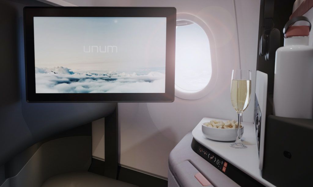
A further option is a smart IFE monitor. A 15in prototype version is fitted to the mock-up, although smaller versions are mooted, at 10in or 12in. The seat also looks great without the monitor, and since the cabin will be fully e-enabled (the cabin management system will also connected) it seems likely that most carriers will select connectivity over embedded IFE (although there is no line-fit connectivity option).
Overall, the space really does have a premium feel. As MacInnes says, “We’re giving some wide-body feel to a narrow-body cabin.”
Economy
As with the current E-Jet, the E2’s economy seats are two-by-two, as passengers appreciate that every seat is either a window or aisle seat. By pushing the seats as close to the fuselage as possible in the new cabin, they are now 18.5in-wide – 0.2in wider than the E-Jet’s already generous seats. The slimline seats can be fitted at a 28-36in pitch (which can be changed easily, thanks to those trick PSUs), and are being developed with Zodiac using Embraer’s data. The seats are currently three months into development, although Embraer says that the prototype designs are indicative of the final production version.
The legs of the seats have been designed to look more like a piece of furniture, and as there are no under-seat support rails, passengers have more space to stow their cabin baggage or stretch out their legs. Further elegance is achieved by creating a two-part molding on the side of the seat to make it appear as thin as possible. The backshell is also slimmed down and has the minimum of parts for a clean appearance.
Options for the economy seats include a footrest, seatback bezels for a 12in or 9in IFE monitor, or a simple high-level storage compartment. A really interesting option being investigated is an electrostatic pad that can hold a smartphone or tablet on the seatback. The pad is currently in development and works in a similar principle to the sticky pads on a gecko’s feet – the longer you keep a device in place, the stronger the grip becomes. It is an unusual feature, and for those nervous of entrusting their beloved device to the pad, Embraer is planning to add a small lip for added security. If the pad option is selected, there is sufficient space left on the seatback to also have an upper stowage pocket and a lower literature pocket.
“We’re 10% into the development work with Zodiac, and will be making a lot of refinements to the seats over the next year to make them as lightweight and robust as possible and to keep most of the prototype’s features. We’re on course to do that over the next year,” explains MacInnes.
A grand entrance
A further option is the modular galley, located at the Door 1 entrance. The design teams felt that there was nowhere at the E-Jet entrance to give a strong branding message, and decided that a plug-and-play modular galley that is fully optional and customizable was a good solution for the E2. Airlines can put their branding down the side of the unit, or can use an optional large display – 32in or 36in – to display a logo, flight information, or even offers from the inflight catalog.
All the electrics and hard points for the various options will be fitted as standard to the galley units, so if the airline decides after delivery that they want to add a display, it is simple to retrofit and create that ‘wow’ entrance. The galley unit is currently in development, but is expected to be ready for manufacture within two years. “It can be produced – it just needs that engineering and certification time,” says MacInnes. “Airlines are keen on it because its customizable and changeable. If they want a different message or language for a different route or their branding changes, they can just change the graphic.”
Bright outlook
Changing the size of the windows was not an option for the E2 project, but Embraer did want to achieve a feeling that the internal windows are larger, creating a greater feeling of space. An optical illusion was created, with the internal window increased in size and pulled further inward, so passengers feel that the windows are bigger.
Again, the design goes deeper than clever styling. With the E-Jet, if maintenance crew need to clean or repair the window, they have to take the seats out and then the window panels, and then put them back again, all of which takes up valuable time on the ground. With the E2 windows, the bezel simply pops out, so it can be cleaned or repaired and then clipped back in again.
Another interesting feature is the dots printed around the glass. Many aircraft manufacturers have problems with misaligned glass, which can mean that cabin trim can be seen from outside. To solve this problem, Priestmangoode employed a trick used in the automotive world, with graduated dots printed on the back of the windscreen covering up any minor misalignment. It’s a simple but effective solution.
At your convenience
The walls of the lavatories have been pushed back to create more space and remove dirt traps, and the fittings were inspired by contemporary hotel bathroom design – especially the tiled back wall. The feeling created is more homely and contemporary than that of a typical ‘white box’ lavatory, and the back wall is a customizable part, which could feature a bright color, a pattern, a logo – whatever the customer wants. Fittings include a mirror, an air purifier, a touchless soap dispenser and a touchless faucet.
There are also integrated handrails for PRMs, and to further help such passengers, an acoustic curtain can be drawn across the entrance area to create a larger, private and soundproof space for accessing the lavatory.
Conclusion
It’s a great design, and as the cabin is currently in the CDR phase, with design freeze expected by the end of the year, the cabin you see here is likely to be very similar to that of the first E190-E2 when it launches in early 2018. Indeed, according to MacInnes, the floor-to-floor elements are 90% complete.
And most importantly, Embraer and its customers are happy with the E2 cabin. As Stein states, “We have been getting very positive feedback for the concept, from operational people as well as senior management. In terms of the concept, we’re nearly there. It’s just a matter of doing some fine-tuning and development, but we’re going in the right direction. We’re very confident, particularly of the new bins and the staggered seats, and we are now seeking more feedback from customers.”


