“Are you sitting down? I have some good news…” That phone call back in 1997 was a defining moment for a team of designers in London who had only set up their studio that year, as it was British Airways telling them that they had been selected to create the new interior for the world’s most iconic commercial aircraft: Concorde.
The design team was Factorydesign, and the voice at the end of the line was Paul Wylde, then design manager at the airline (now owner of his own design agency), who was responsible for the overall creative direction and design management of the new Concorde experience.
The cabin design project – the third and, sadly, final incarnation – presented unique challenges. The magic of the exterior design, which, even at 30 years old, still looked incredible, had to be translated into the interior, while also conveying BA’s conservative style. “The great irony about Concorde was that it was the oldest aircraft in the fleet but still commanded the perception of innovation and futurism,” recalls Wylde. “We had to be true to its age, yet still position the brand as modern, relevant and unique.”
The team was, of course, tempted to make the interior feel a little futuristic, but brand, product and perception research showed that ‘classic contemporary’ was a more appropriate design vernacular.
A flight on Concorde from London to New York was an expensive ticket – around US$8-10,000 return – but the compact cabin meant that did not translate into the full first-class experience that B747 passengers enjoyed. “Concorde was a sports car, not a luxury SUV,” says Wylde. “Less is more – Concorde was about buying time, not luxury. Unless something was truly needed, we would rather not have it in the cabin at all.”
Adam White, one of the founders of Factorydesign, recalls how they carried that efficient ethos into the design of the bespoke double seat design, created with Britax Contour. “To match a philosophical approach we coined, if a visible part is not adding function, we don’t want it on the seat.”
Out went the aluminum fabrication, which had many parts held together by many more fasteners, and in came a one-piece carbon fiber seat, mounted on a frame that offered the strength needed to do the job, but was styled well enough that the standard plastic and upholstered covers were no longer required.
There was still scope for some flair and branding on the seat though, with the armrest mounted on an aluminum casting that was immensely robust, and styled and polished to look like BA’s ‘Speedmarque’ logo, a subtle way for the airline to ‘own’ the interior without obvious branding , which was another element of the original brief.
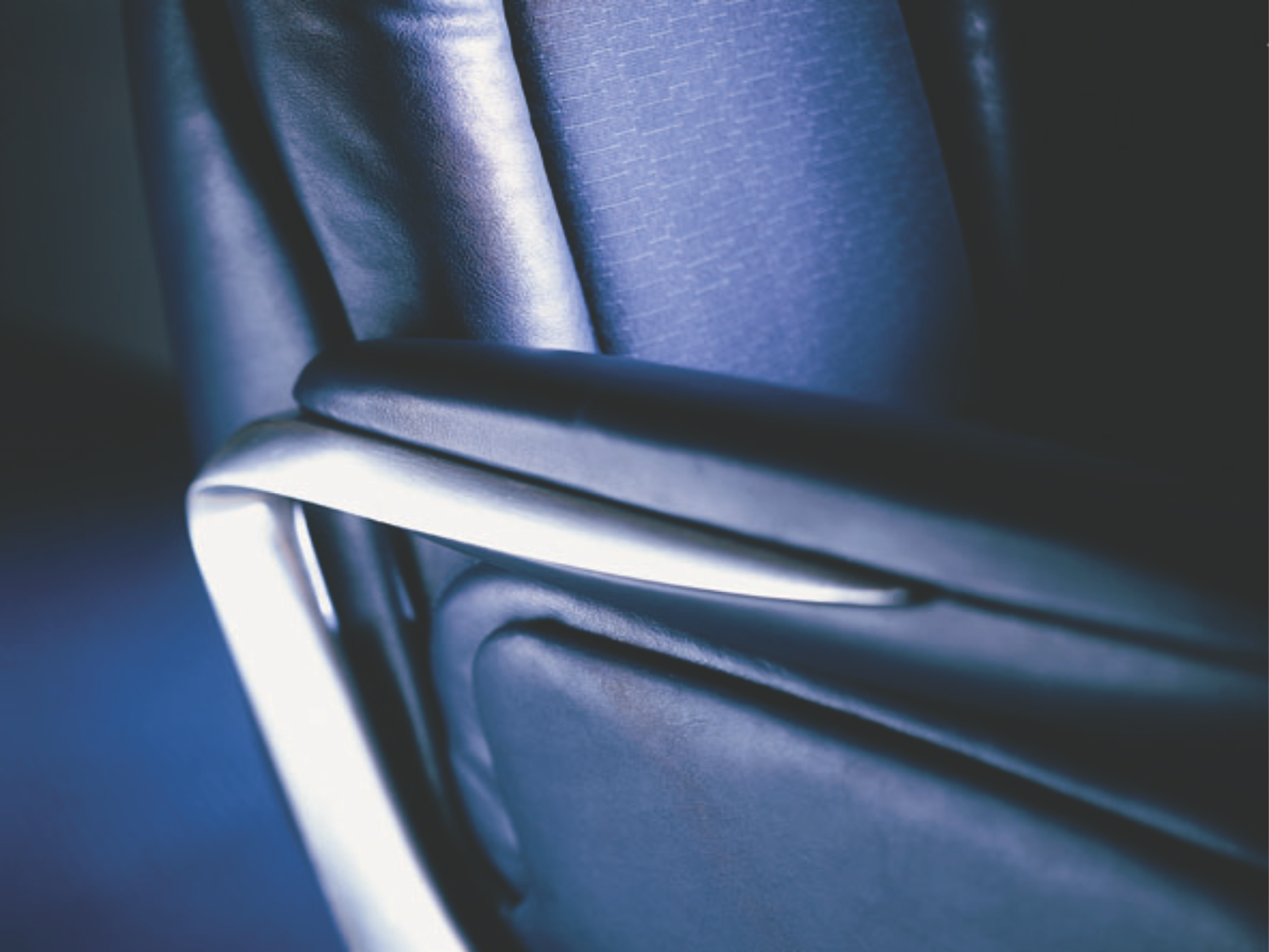
The previous seat models had a feature whereby the center armrests could be pushed down to the seat pan to turn a double seat into a single, for the wider passenger or to afford extra comfort. However, the mechanism was deemed a little clunky and difficult to operate. Instead a twisting device was created in the mounting, so that as the passenger pulled the armrest up and out of the way, it automatically turned through 90°, which allowed it to slide between the seats. The radical rethink of the seat design, multiplied over 100 pax places (40 in the forward cabins, 60 aft), meant a significant weight saving was made overall.
The styling was intended to be timeless, calm and confident, with a subtle and high-quality Connolly hide used on the seats, and Sir Terence Conran was brought in to work on some of the soft elements. However, a little of what White calls “wit and drama” was included to remind passengers of the marvel they were flying in, especially when the party piece of breaking the sound barrier occurred. “Given that every flight had ‘once in a life-timers’ on board, we wanted to give them a signal, some sort of sign that Mach 1 had been reached – but not something that would disturb the regulars,” says Berry.
The team decided on blue LEDs incorporated into the ceiling lighting which, at the moment of passing Mach 1, sent a pulse of light from the front to the rear of the cabin. “If you were waiting, watching, on the edge of your seat, this was thrilling,” says Berry. “If you were sipping champagne and reading the Wall Street Journal, you didn’t notice.”
An incredible project, marrying technology with comfort, and a cramped cabin with some of the world’s most demanding and highest-paying passengers. But as Wylde remembers fondly, “We all knew it was a once-in-a-lifetime project and giggled throughout the program. Just like kids at school.”
Seven in one
Adam White found that working on Concorde’s interior was a challenge, but even more so when they realized it was seven individual projects. “Every aircraft was different, and BA had seven of them,” he recalls. “They were essentially handmade and the drawings existed in bank after bank of wooden plan chests, all drawn on thick vellum paper. So at times it felt like we were working on restoring a very fine classic car, rather than working on a commercial aircraft.”
Ideas that didn’t fly
Factorydesign found a small amount of previously unused/ unrecognized space within the cabin and saw it as an opportunity to completely redesign the bathrooms (lav is too vulgar a term for a BA Concorde), and as Adrian Berry says, they were “manufactured and ready to go and looked fabulous”. Unfortunately they never made it onto the aircraft prior to its decommissioning in 2003. The idea of a bar was also mooted, but with limited headroom, even in the middle of the aisle, the plan was deemed impractical.
