When Captain Woranate Laprabang, managing director of Thai Smile, was deciding what image to convey through his new lower-cost airline, intended to serve short-haul destinations, he stipulated, “The main aim for the cabin design is to develop a cabin that provides an impressive look and feel with a fun, vibrant image to represent our ‘trendy, friendly’ brand character.” Sounds simple, but what if the design house had only six weeks to create the concept, from name, to livery, to baggage tags, to palette, to textiles, to website?

That is exactly what design house Priestmangoode was faced with when it was offered the job. Director Luke Hawes explains, “I was having dinner with the president of Thai Airways in late August 2011 when he mentioned they were starting a low-cost airline and asked if we would like to design it. He then said he needed to send the drawings to Airbus in four weeks. We stretched that to six weeks for the whole concept, which had to include parts numbers for trim and finish, naming, livery, etc. We then had another three months after critical design freeze with Airbus. From the August dinner with the president, we delivered the product in June, so that was less than 12 months from concept to actual supply. Sometimes when you have less time and have to make things happen, some of your best work comes out, because you have to go with your gut feeling.”
What’s in a name?
So where to begin? Well, a name for the airline would be a good start. With no time to launch a competition via social media to find a suitable name for the airline, as is popular nowadays, finding a name became part of the design brief. The Priestmangoode team, which comprised between six and eight people during the project, brainstormed for a week, and came up with the winner within two weeks, to replace the management’s working title of Thai Wings. More than 75 names were considered and dismissed in the process, including My Thai, Thai Thai, Thai Orchid, Thai Local, Thai Together, and Thai Spice, before the winning Thai Smile was selected – actually one of Hawes’ ideas, inspired by the friendly cabin crew. “Some of these things you have to explore to reject,” he says.
All the names have two things in common. The first is that they are all English words. “Thai wanted global appeal from all corners of the world,” explains Hawes. “It was important that the name is related to something like service rather than a random name.”
Laprabang further explains the English choice as the need for a common tongue: “Thai Smile is positioned as a ‘regional air service’, not just a domestic service. According to our long-term plan, 70% of our capacity will cover short-haul international destinations around two or three hours from Thailand, focusing in three main areas: China, India and ASEAN.”
Lively livery
The second thing that all the names had in common was that they contained the word ‘Thai’. This was to ensure that customers know that the airline is part of the larger Thai Airways brand – indeed Smile is completely integrated within its parent, with no separate offices.
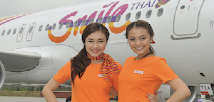
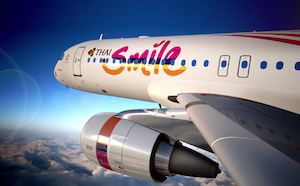 The relationship is also made clear as the full logo is incorporated into the Smile livery on the fleet of A320-200s. There is a strong contrast between the two airlines in the livery, though. With the name selected, a whole new project began, to choose between hundreds of fonts and colours for the logo. In the end, the word Smile looks like it was drawn using a marker pen, which is exactly how it came about. The playful script, complete with a happy dot in the ‘i’, beams alongside the more serious Thai Airways logo. Thai Airways mainly uses purple, gold and magenta in its branding, and for Smile the purple and magenta were retained, while orange was introduced for vibrancy, and the gold was changed to a more youthful yellow. If required, the logo can be run in monotone, in pink, purple or yellow.
Aside from the logo, the livery includes the heritage Thai Airways empennage design, with a ribbon in the Smile colours extending from it, again showing the link between the two airlines.
A brightly coloured fuselage was also considered, but as Hawes explains, “The darker the colour you use on the livery, the hotter the aircraft gets, which means the air conditioning has to work harder, which raises fuel costs. Lots of things come into play in livery design.”
Ground rules
The critical aspects of creating a brand personality for Thai Smile centred around five key concepts created by Thai’s top management: speedy, vibrant, friendly, fun and trendy. With only those words, and the stipulation that the Thai logo was to be incorporated in the livery, Priestmangoode was free to explore the five key elements of the brief.
The friendly and fun aspects are already covered by the name, the playful font and ribbons, and the crew, while vibrancy was introduced through the new, brighter and bolder shades in the corporate colours.
Mood boards were created, with blues reflecting the islands, greens the jungles, oranges the sunsets and temples that are part of Thai culture, and pinks reflecting the flowers and silks of the country.
The trendy aspect of the brief is addressed, fittingly, by easily replaceable items such as cabin accessories and crew uniforms, while the speediness is addressed by the stripes in the logo, and the trim and finish, which reflect the fast-moving lights of Bangkok.
On board
While the airline is low-cost, Thai did not want a budget experience in the cabin; it wanted passengers to be reminded they are flying with a Thai Airways brand, and that they are going somewhere special. On paper, the Smile experience is fairly no-frills, with prepacked meals and no IFE, but with the longest route currently being three hours, and the average route 90 minutes, a luxury experience is not required – but that does not mean it is unsophisticated.
The seats are B/E Aerospace Pinnacle models, chosen because, as Laprabang explains, “It’s a well-designed seat that provides a high level of comfort for our passengers.”
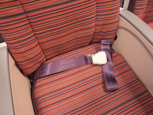
The Thai feel is achieved through the trim and finish. Many colour options were explored for the seat fabrics, such as maroons, purples and blues, highlighted with accents. In the end, a striped fabric featuring the key Smile colours was chosen – again reflecting the ‘speedy’ part of the brief – with the headrest covers clad in a purple that ties in to the parent airline’s colours.
“We looked at going more corporate, but decided on the warmth of this design. The rich textile feels almost hand-crafted,” says Hawes of the seat fabrics, supplied by Botany Weaving. “These stripes are about colours blending in and bleeding out. It’s a nice, refreshing look.”
Getting down to colour specifics, the primary palette is a purple similar to the corporate colour (Pantone 276 C), a bright orange (Pantone 158 U), a vivid pink (Pantone 233 C), and a bright yellow (Pantone 7406 C). To really help these bold colours stand out, a more muted secondary palette was created, with a grey (Pantone 426 U), putty (Pantone 7529 U), and two bespoke dark aubergine and brown shades.
Hawes explains the colour choices: “We chose the primary colours and then put together a secondary palette of darker tones to support that. You can’t use the bright colours everywhere or it will look like a sweet shop. The supporting colours are used for the dado panels, and entrance and exit areas – anything that had to be more neutral used the secondary palette to support the primaries.”
The idea of breaking up rows of seats into different colours, or featuring different colours of headrests, was considered and dismissed as unnecessary, given the size of the aircraft, which is configured with up to 156 economy-class seats in a 3-3 configuration.
The carpet is dark purple, again similar to the Thai Airways fleet, while the rich Thai culture is reflected in the detailing on the curtains. However, nothing is intended to detract from the main focus of the striped textiles. The finishing touch is a set of surprisingly understated brand panels on the front and rear walls, finished in a matte silver, with the Smile logo picked out in aluminium.
Having also designed the cabins for Thai Airways, Priestmangoode saw the Smile project as an opportunity to be less corporate. “We’ve created a brighter cabin because it’s more of a budget airline with passengers in a holiday mood, and it’s a chance to be bold, although I wouldn’t go as bold as easyJet with just one colour,” says Hawes.
Small business
There is also a ‘Smile Plus’ short-haul business class, which is available in the first four rows of the aircraft on international flights, and the first three rows on domestic flights. This class is a basic offering of an empty middle seat, a little more pitch, and with a hot inflight meal included (hot meals are a buy-on-board option in economy), although extra landside services include priority check-in, a 30kg baggage allowance, and use of a lounge. However, this may be upgraded in the future. “We are considering offering business-class seats two-abreast in our future fleet,” says Laprabang.
Service with a smile
 At the heart of the experience, and of course the very inspiration for the Smile name, is the crew. The friendly and efficient service is a given, thanks to the standards of Thai Airways. However, to address the ‘trendy’ requirement, the uniforms needed some thinking.
“The crew wear very traditional dress on Thai Airways, but we wanted a more contemporary look for Smile, with options of trousers and skirts, but just one colourway,” says Hawes.
Priestmangoode brought in fashion consultants at an early stage to help put together thoughts of what looks classical, what looks trendy now, and what will be trendy in two years’ time. The chosen designs reflect the orange shade that differentiates the Smile brand from its parent, with the corporate colours picked up through accessories. However, the style selected is still smart. The option of a more traditional top in Smile colours, with jeans underneath, was considered, but eventually dismissed.
Other elements
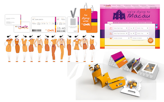 The four primary palette colours are also used throughout the final elements of the design, such as snack boxes, boarding passes, baggage tags, and menus. Priestmangoode also used these themes when designing the Thai Smile digital products such as websites, apps and booking engines. This task was made simpler as these systems are based on Thai systems, rebranded for Smile.
“Creating a whole new design and branding process is a first for us,” concludes Hawes. “These projects are rare – about one a year – and are something we want to get into more. Creating a seat or interior is our bread and butter, but now we’ve created an entire low-cost brand, we would like to do it for some big players with big aircraft. It was a frantic project, but one we’re very proud of.”
