The first-class travel experience begins at home – most probably a nice home, with comforts including sleek, contemporary furniture from the likes of B+B Italia, Vitra or Knoll – moving on to a luxury car, then an airport lounge featuring select design classics. On some airlines the next experience is rather jarring, with an ugly seat trimmed in a garish coloured leather – but not in TAM’s new first-class cabin, launched in late 2012. When the airline set out to create an upscale domestic look, it really meant it, with the goal being to create a ‘home from home’.
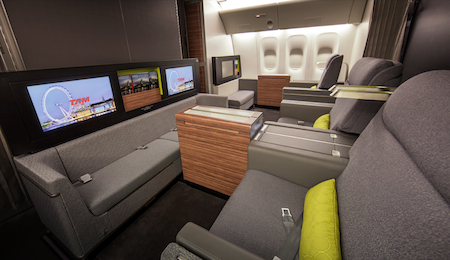
Looking for inspiration, TAM attended Aircraft Interiors Expo in 2009 and found the perfect starting point in Priestmangoode’s Open Space concept, which was being showcased on the B/E Aerospace stand. A contract was signed between the two companies, and from that point work began to make the concept feel not just like a home, but a Brazilian home. This is more than just a nice idea; home is a key theme of Brazil’s family-oriented culture and was therefore a key design direction.
Priestmangoode designers set off on an arduous research trip, looking at upscale restaurants and five-star hotels in Brazil and visiting home exhibitions and interiors showrooms in São Paolo, to find the colours, shapes and details that could give the cabin the feel of a contemporary Brazilian residence.
The research complete, designs and colour palettes were drawn up for a 777-300ER and the renderings presented at TAM’s São Paulo headquarters in mid-2009. The response was so positive that, save for a few tweaks, the proposal was almost exactly the same as the product that launched in November 2012 – to within 5%, according to Priestmangoode.
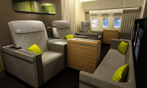 “TAM’s first class is one of the best examples of our cabin vision coming true. We presented our vision, they said “Wow, do it”, and three years later the product is really close to that vision [rendering shown on left]. We deliver what we design by having great relationships with our suppliers and vendors. You won’t see too many examples of this. I’m proud of what we achieved,” says Luke Hawes, a director at Priestmangoode who was in charge of the project.
The main changes were that the contours of the seat and ottoman were further softened to enhance the home feeling, and the window curtains were rejected. “They proved too much for Boeing, but it will happen soon – they are on every other mode of transport and on private jets,” says Hawes.
Staying so true to the renderings was all the more remarkable since no trim and finish work preceded them. It was possible to replicate the concept colours and finishes thanks to hard work by suppliers such as B/E, Isovolta, Botany Weaving and Anker. “We went through round after round of sampling to get it right and it’s a real winner for us as a translation – and for the team who delivered it – as we were quite challenging,” adds Hawes. “We knew TAM wouldn’t want compromise and it was great to have a client with that passion for the design.”
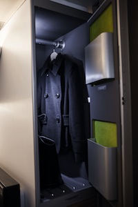 The palette was conceived as a neutral base on which textures and colours can be layered. With such neutrality it is no surprise that the lime-green cushions with bold circle pattern really catch the eye, as does the green finish on the stylish lamps and the aft-wall branding panel. But as you explore further you find that same green colour repeated where you least expect it. This was the ‘reveal and surprise’ element of Priestmangoode’s brief, so you’ll find green flashes in the ‘library’ between the 23in IFE screens, which contains inflight magazines and Wallpaper destination guides, inside the personal stowage compartment, and even hidden inside the fold-down shelves in the wardrobes (right). Half-height and full-height versions of the wardrobes have been designed for different aircraft. As well as being used to stow coats, they can hold amenity kits and pillows, to keep the seat area clutter-free.
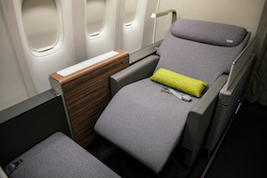 The seats are based on B/E’s Oasis super-first-class product, specified with only minimal privacy shells. The shells were designed low because, as well as not fitting in with the residential feel, with only four seats in the cabin, privacy is not a real issue. When the 29.5in-wide seat is fully reclined via a sleek touchscreen, it links with the ottoman to create an 80in-long bed. Ottoman is perhaps not the best term in this instance; sofa may be more appropriate. This piece was styled like a residential sofa, which not only continues the home theme, but also serves a home function.
“In Brazil, it isn’t uncommon to find mum and dad flying first class, with the kids in economy. The whole idea of the ‘sofa’ is that the kids can be invited up to dine with the parents. This is a super-indulgent lounge space,” explains Hawes. It also explains why the tables are extra large – so that a family of four can dine together.
Even the legs of the seat and sofa are purely cosmetic, there to enhance the illusion of home furnishings, as all the seat tracks and kinematics boxes are set back out of sight. While both pieces ‘float’ to give a feeling of space, the legs make them look “like a proper piece of furniture you’d have at home”, says Hawes.
While the forward and aft walls are neutral, the forward wall did go through a modification from the original design. Inspired by São Paolo restaurants, the front wall was first designed with a 3D blocky effect in timber, as was the Door 2 entrance, but as Hawes says, “That was pushing them a bit too hard!” Instead a textured foil was developed.
Family values
If first class is intended to be the lounge of the home, the main cabin is the family room, with bold reds, greens and turquoises featuring. The brighter colours are at the back of the cabin, which gives a feeling of excitement rather than dread at being seated toward the tail. “It gets more playful as you move through the aircraft,” says Hawes.
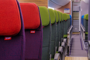 The seats, arranged 3-4-3, are based on standard 17in-wide models from Weber set at a 31-33in pitch, but the backshell has been customised for better integration of the bezel for the 9in IFE screen, and details such as the literature net and coat hook are also bespoke.
“We did a lot of work with Weber to get the detail and customisation right. Weber described it as one of their best economy seats ever, which was nice,” adds Hawes.
Covered in a soft, dotted nomex fabric, with the headrest and lower backrest finished in a brighter tone, the seats are intended to recall garment design, inspired by Brazil’s love of fashion. “We tried to get this fashion garment concept through without compromising comfort. We also have little fashion labels on the headrests rather than embossed logos. Little touches like that set the airline apart,” says Hawes.
The pale timber veneers applied to the forward and aft walls temper the bright seats, and a brand panel featuring a pattern found on the pavements around Copacabana beach complete the effect.
Moving up
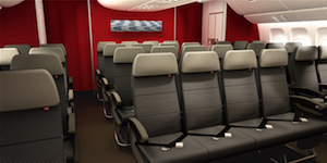 The premium economy section (TAM Space+) is arranged with 34 seats in a 3-4-3 configuration, offering slightly more recline and pitch. The seat is the same Weber model as found in economy, but with a more serious grey fabric, a fold-down footrest, a restyled seatpan, and more foam on the backshell to create a distinctive appearance. The neutral palette is lifted by the bright red aft wall, which also hints at the bright colour to be found beyond the curtains in the main cabin. A brand panel, laser cut in a pattern inspired by São Paolo design, adorns both walls.
The heart of the home
Whichever class you’re travelling in, you enter via the galleys, which were engineered by Sell in a restrained style. The timber-effect laminate floor is a welcoming feature when boarding, and the TAM brand and the South American feel are conveyed through a wooden brand panel, as well as windows cut into the galley for inflight magazines, and a monitor showing iconic images of Brazil. “That’s the look on boarding – branded, but not overbearing,” says Hawes.
The lavatories are standard line-fit Jamco fare, though the floor is striking, created with Gerflor to again echo the pavement designs of Rio. A more daring design for the lavatories was proposed by Priestmangoode, with a mixer tap to the side of the sink and a ‘floating’ vanity unit so that passengers could get their feet underneath for easier access. However, these ideas didn’t make it to production.
Business as usual
There is surprisingly little to say about the business-class cabin, simply because it is exactly the same as found on other TAM aircraft. You will find the same angled lie-flat Weber seat still serving, with its grey shell and maroon textiles and leathers. The reasons for this are currently confidential, but the airline has confirmed that future aircraft will feature a new business class.
Colour and trim
“It’s difficult to capture the spirit of Brazil as it’s such a huge place with so many things to tap into, from the beaches in Rio, to the Amazon, and everything in between. It’s very glamorous,” says Hawes, about the challenge of creating a palette to reflect the country.
Key themes were drawn up, including ‘reveal and surprise’, reflected in the hidden splashes of green in first class; ‘shell and protect’, whereby the seats look hard and safe on the outside, but soft inside; ‘flowing’ so that design cues are found throughout the aircraft; and ‘changeability’, which includes the option to swap items such as cushions and brand panels. “Everything we did with the textiles has a relationship to garments and fashion because Brazil has a huge, glamorous, fashion industry,” says Hawes.
Clearly the corporate red needed to feature, but “it fights everything else”, so apart from the red-themed business class, and rows of red seats in economy, the colour was used only in areas such as brand panels, bulkheads and the IFE home screens.
Application of the brand was not just a matter of slapping a TAM logo on surfaces; depending on the material it is being applied to, whether that is leather, aluminium, wood, suede or textiles, the logo could be stitched, paint-filled, laser cut or embossed.
Carnival atmosphere
TAM chose Panasonic’s eX2 IFEC system for the new B777 aircraft in a deal that will also see the eX3 fitted to its 27 A350-900s that are on order. TAM and Priestmangoode worked hard to get the detailing right, and specified Karma handsets in first class. Customers can choose films, travel advice; an e-reader with Brazilian weekly magazines; duty-free shopping; music; TV shows; games; and unique content on the TAM Kids channels.
The hardware and content offer is great, but the real design work went into the GUI. Priestmangoode took the Panasonic platform and designed a custom layer over the top to transform the user experience. Choices are made via pop-up menus, with large images for items such as album covers adding to the ease of browsing, with the TAM red as the background colour aiding branding and legibility.
Panasonic and TAM needed a little convincing to proceed with the customisation, but to Hawes it was worth it. “For me the IFE is what you look at during a flight, so you can’t just have a standard look and feel with a little badge in the corner. It needs to be wrapped up as part of the whole experience.”
The future
It’s a stunning interior, but its future hangs in the balance following the merger of TAM and LAN to create LATAM. And don’t forget that LAN also has a new interior, designed by New York-based MBLM. Details of the rebranding are still being worked out, but a LATAM official has confirmed that, following a selection process, Priestmangoode will be its design agency. In the meantime, we hope the new TAM interior, especially the stylish first class, can be enjoyed for at least a few more years.


