With an order for 12 A320s in place, it was a good time for South African Airways (SAA) to look to introduce greater fleet consistency – and a new look. However, it was also a short time – just 15 months until the first on-dock date. A choice presented itself: stick with existing suppliers, do some in-house CMF work, and have a quick and simple project; or go further and bring in a design house, new suppliers and a new cabin design? SAA chose the latter, which now forms the basis, not just of its narrow-body interiors, but its future wide-body designs too.
The A320 seats are all sourced from Geven. In such a short timescale, selecting a new seat supplier was a bold move, but it was a matter of necessity. The usual catalog choices were gradually crossed off the list as they were deemed unsuitable, too expensive, or not available for delivery by the deadline. However, the flexibility that many smaller seating companies can offer proved useful, and Geven presented a solution that would meet the airline’s cabin requirements, and its cost and time constraints. That doesn’t mean a straightforward project lay ahead though. Far from it in fact, especially since the business class seat hadn’t been certified yet.
The seat in question, the Comoda, was launched at Aircraft Interiors Expo 2012, billed as an extra comfortable single-aisle business seat, weighing in at 21kg per pax place. (Indeed ‘comoda’ is Italian for ‘comfortable’.)
However, the design house SAA brought in – Priestmangoode – wanted to make some modifications to the standard Comoda product to enhance the styling and privacy, and add a few more features. Leveraging the muscle of SAA, Priestmangoode succeeded in negotiating some substantial customization of the seat, while the SAA team, led by Myriam Bracke, executive manager of product development, also flexed a little muscle at Airbus to convince them the seat would be ready for the on-dock date – while also pushing back that date a little. As Bracke says, “We had to a lot of pushing, pulling and negotiating.”
While the Comoda seat wasn’t certified, at the time SAA got in touch with Geven, the engineering work had progressed to the point of being ready for certification. “We came in at the end of the engineering phase and wanted to change a lot of items, but hats off to them, they accommodated 60-70% of it,” says Luke Hawes, director at Priestmangoode.
The team left the major elements such as geometry and actuation as standard, but exerted their design influence on the shape of the backshell, center console and end bays. Overall there was a general tightening of tolerances and split lines and some refinement of the backshell, including a tablet holder. Privacy was a big concern for the team as there was a large gap between the seats. This space was minimized, and the center console was extended with bottle holders to further improve privacy. Some extra stowage space was also added for small items such as books and glasses, and the magazine stowages were expanded.
The main focus of the customization work was the center console. Priestmangoode was keen to alter the shape of this element for aesthetic reasons, and to add some efficiency to the design.
“The console is quite a story, particularly in the timeframe,” says Hawes. “There was some wasted space, so we flattened areas for cocktail tables, moved the sockets, added stowage, and scalloped the sides as much as possible to enhance comfort. Geven re-engineered the structure to put things where we wanted them.”
Thankfully the economy seats were a much simpler proposition, with the standard Geven Piuma chosen. Its trim and finish proved a little more challenging (more on this later).
Tablet holder
One of the major changes the team made to the Geven Comoda business seat was the addition of a small shelf in which a passenger’s tablet can be slotted to create a removable IFE solution. This setup saved project time, and also airline costs, as it cuts down on software issues, cabling and maintenance. To ensure the entertainment doesn’t go flat, a USB charging point is also incorporated.
SAA is also trialling a loan system of Samsung tablets on flights of over four hours to see how well the logistics work, and has put out a tender for IFE content distribution.
Myriam Bracke, executive manager of product development at SAA, explains the decisions they made on IFE for the A320s: “We did a business case on IFE, and giving power for all passengers is important. We have USB and PC power for each passenger in business class, and shared outlets in economy. We didn’t want embedded IFE due to the weight, and also the restrictions it brings. If you want to put in a couple more seats it becomes extremely difficult when you have embedded IFE systems. These A320s will fly everything from a short route of one hour from Johannesburg to Durban, to a four-hour route from Johannesburg to Kinshasa. To carry the extra weight on a Durban-Johannesburg route doesn’t make sense.”
Panel show
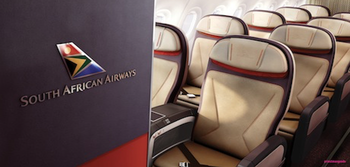
A lot of attention was paid to items such as brand panels, the first of which – a proper enamelled 3D logo in the shape of the tailfin, not a print – is on an anthracite-colored panel mounted on the side of the galley to greet passengers as they board. The band continues round to the front row, with an anthracite-coloured magazine rack featuring a burnt orange foil background, and a monitor with an anthracite surround.
It’s very simple and smart, especially with the silver wall featuring a linear weave design providing the backdrop, although finding a suitably dark monitor surround posed some difficulties, as did coordinating the monument supplier (AIM Aviation), the décor supplier and the monitor provider to work together and create a seamless look.
“What appears to be a lovely way of containing the function of the bulkhead with this anthracite band is actually quite complex. Visually it just looks nice, but to actually implement it with all the tolerances right is quite a thing,” explains Hawes. “The A320 catalog is verging on the A350 catalog in terms of being quite restrictive. If you’re trying to do something to bulkheads or monuments, it’s quite a challenge.”
However, that problem was a breeze compared with the panels at the rear of the cabin. These simple-looking metal panels, which run the full width of the walls at either side of the aisle, and again feature 3D logos and an acid-etched 3D textured linear weave, created difficulties for the team. The problem was that the magazine pockets that extend the full width of the panels, complete with acid-etched aluminum cladding, had to comply with the restriction of 5kg on the attachment point. Through a series of refinements, the team reached their design aim – again, an impressive feat, given the timeframe.
A continent in one cabin
SAA is the flag bearer for the entire continent of Africa, something it wanted to reflect in the CMF. This is no small task, given that Africa has 54 countries, nine territories and two states. Bracke’s brief of “80% South Africa, 20% Africa” narrowed the field a little, but as Hawes says, “South Africa alone gives us a huge variety of cultural cues to pick up on, and to then think of 20% Africa is quite a challenge. It is similar to when we had to capture the feel of South America for the TAM project [see HERE], but I’d say this is at a bigger scale.
I was astounded when I studied the map of Africa and saw the number of countries, all of which are very different. It’s mind-blowing. Africa is hugely rich in pattern and color. We looked at a vast array of patterns from local communities, including basket weaving, arts and crafts, and beadwork. It is all incredibly colourful and we had to extract some of that.”
The strict time pressures also helped to narrow choices, as the team had to use reasonably standard materials and processes, and limit complexity for vendors. Gold and anthracite were decided upon as the main colorways – partly because gold is an important part of South Africa’s heritage – and that 20% of Africa was introduced in small but striking ways.
The gold curtains feature a subtle arrow pattern, which has been derived from Brand Union’s recent work on revitalizing the airline’s livery, branding and touchpoints. A series of artworks was created that translates the main airline branding into secondary brand elements, of which the arrow pattern was one. Likewise, a subtle spear pattern is used on the decorative laminates. Less subtle is a statement artwork from Brand Union, which picks up the bright tailfin colors and features as a backdrop to the magazine pockets. This panel can be swapped out for other colors and patterns – to promote sporting events, for example.
The seats are all finished in a golden leather, which is a soothing tone as well as a depiction of sun and soil. Some initial work went into creating a textile for the business seats, but time pressures dictated leather. However, Bracke indicates that the idea will be revisited for the wide-body fleet.
The business seats are enlivened by an embossed logo on the headrest, and feature stitch lines in a punchy orange that picks up on the arrow shape in the airline’s logo. The statement artwork again appears, as a reveal between the headrest and seatback. The pattern in this fabric from Botany Weaving is block printed so it is exactly the same in each seat, and covers the entire background to the headrest, so the more the headrest is squeezed or the wings moved, the more colour is revealed.
“This took a massive amount of work to get right and I was really worried about it,” says Bracke. “We tried many options. Initially it was full color, then we tried an embroidered fabric, but it ended up being very expensive. Having an element of surprise was always a big thing for us. We wanted a little something to ‘pop’ to the passenger.”
These efforts are also carried over to the economy seats, with the stitch lines in black, and the reveal in a vibrant blue. Further work, such as tightening tolerances and wrapping the leather further round the seat, also helped to make the Piuma’s design their own.
One real extravagance was chosen: the blue light strips that run along the overhead bins. Not many airlines select this expensive Airbus option – Lufthansa is among the few, with its yellow strips – but SAA felt it added some interest to the passengers’ view.
With an anthracite and gold carpet with a speckle, earth tones in the seats, and the blue strips overhead, the landscape and sky of Africa are represented, with its people and culture adding bright flashes.
The next steps
SAA is seeking to achieve greater consistency across the passenger experience. Brand Union’s rebranding work has tidied up elements such as the visual identity and brand assets, and the work done on the A320 cabins will also translate into the forthcoming new wide-body fleet. The color palette will be carried over to the wide-bodies, although the business seats will be trimmed in fabric instead of leather. The carpet and curtains will also be used, as will some custom items such as the galley flooring, as well as the new service items.
While the exact models of wide-body aircraft due to enter the fleet aren’t known yet, preliminary work is underway. Preferred seat types are being assessed, including a potential first class. Special attention is being paid to business class, as Bracke says: “We want a very good business class seat. We have a flat bed model now, but it is quite old. We also need to make sure we retain or extend the seat count, while enhancing the experience.”
Author: Adam Gavine
