The launch of Malaysia Airlines’ A380 marks not just the arrival of its new flagship aircraft, but also the culmination of eight years of work, including a major rethink of the design halfway through the project.
One man who has been involved in this project from the start is Nigel Goode, director at design consultancy Priestmangoode. The firm had previously worked on refitting the airline’s B747 first class cabins with everything from seats to sidewalls, a design that was completed in 2004. When Malaysia announced its order for six A380s in the same year, that didn’t mean an automatic shoe-in though. To make sure the airline’s flagship was as good as can be, various manufacturers and designers were invited to pitch for the project in Kuala Lumpur, and their proposals were judged not just by the board, but also by frequent flyers. “It was an ordeal, but we won the pitch,” says Goode.
The ordeal didn’t end there as the aircraft deliveries were delayed from 2007 all the way to early 2012, and with the design ready to be installed in 2008, the delay gave the airline time to reconsider and substantially change the interior into what we see today on the long-awaited A380: a 494-passenger configuration with 420 seats in economy, 66 in business, and eight in first.
True colours
The first design task was to rationalise and look at the airline’s corporate identity for the colour palette. Work began on differentiating the classes, picking up on the airline’s new corporate graphics. The intense blues of the previous business class were muted, the luxurious reds associated with first class were extended into the cabin, and to break up the hundreds of economy seats, the two economy cabins feature a mixture of red, blue and mauve. The idea is that the furnishings will be relaxing, with colour added by LED mood lighting in the premium cabins, and also the blankets and passengers. “We wanted the whole aircraft to be harmonious, with a warm feel all the way from first class to economy,” says Goode.
Of course the aircraft must also convey a feeling of Malaysia, but this has been done in an understated way. “It can be a mistake to use clichés such as orchids in the colours and fabrics,” says Goode. “The crew are Malaysia, they give you the Malaysian feel and hospitality, with how they dress and act. The cabin is a backdrop for the service, and they shouldn’t clash. Sometimes less is more. It’s a big temptation to add details, but you have to stick to quality.”
And for those entering at the sharp end of the lower deck, they will find just that…
First class design
 In the initial configuration, First Class was a 12-seat cabin located at the front of the upper deck, with a small lounge at the top of the stairs. However, when the project halted, and with time to reflect, Malaysia executives changed their mind about the configuration. First Class moved to the front of the main deck, and to offer greater luxury, the seat count was cut to eight.
“This is the airline’s flagship so they wanted it to be the most luxurious, the most premium. Our brief was really to think of the passenger throughout,” says Goode. “The Malaysian experience doesn’t need gimmicks, they just wanted really wide, comfortable seats in all classes and the best passenger experience, creating a seamless journey from the lounge to the destination.”
Malaysia selected EADS Sogerma’s Ultimate 17 as the basis of the design, and with it came a potential marketing superlative for the airline: the widest seat and bed in the air, at 40in.
The previous design Ultimate 17s seats on board Malaysia’s 747s, due to be retired as the other five A380s join the fleet, are very open, but for the A380 they wanted to create ‘mid-privacy’. Aside from its dimensions and the kinematic, the seat’s origins are unrecognisable. Creating the new seat required a close working relationship with Sogerma, and in the end, Goode is proud of how close the final product is to the initial renderings.
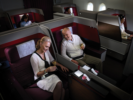
The sides of the seat and the ottoman are clad in dark wood and a dark purple leather, which is accented in the other cabins and also echoed in the Lantal carpets. Life is added through the red, purple and pink dots in the dark, sculptured seat fabric designed with Botany Weaving, and also through bright flashes of red Tapis ultrasuede wrapped around the inner seat shell and IFE monitor, and even under the stowage compartment lids. The dot colours were drawn from the company’s previous logo, though it was updated in March by Landor, to create a simpler design using three shades of blue. However, the red is still used to differentiate first class, with boarding passes and other items still printed in red.
To ensure fabric quality, Malaysia conducted extensive comfort trials, checking densities of foam, wash tests, and wear tests. All the fabrics were also taken to the Airbus factory to see how the colours reacted under the various mood lighting sequences.
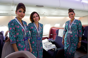 The overall feel in first class is of understated luxury, which was the aim. “It’s down to getting the feeling of warm Malaysian hospitality through, so the crew should be the focal point. This is really a vehicle for the five-star crew to work, with everything in its place, and an understated contemporary hotel style,” says Goode. “Everything is sophisticated and seductive, but we also worked a lot with the Malaysia team to see the reality of how it can be maintained. The slightly muted colours work in service as they don’t need constant cleaning and give a harmonious feel.”
This low-maintenance approach was taken throughout the aircraft, with cabin crew and engineering working closely with the design teams to ensure that everything works as well as possible. For example, the aisle-side cocktail tables enable the crew to give you a drink without intruding into your private space, and were specified with cabin crew input so they could accommodate everything they need to during service. A lot of time was also spent inspecting the 747 fleet to see where seat scuffing and damage had occurred, and consulting with maintenance teams to see how to prevent that damage on the A380 without just adding ugly bumper strips.
Passengers with the coveted red boarding pass will appreciate the wide seat, which is firm but comfortable, with an 87in pitch. The dining table top, like its lid and the cocktail table, has a dark granite veneer, giving a pleasant feeling of solidity and coldness. There is generous knee room underneath should you want to use a laptop on the table, and a friend can join you for dinner on the ottoman opposite.
Many airlines wishing to create a sense of privacy in a suite opt for a sliding door, but Malaysia decided to keep the entrance open. As Dato’ Salleh, head of customer experience at Malaysia Airlines explains, “One of our strengths is in having the best cabin crew in the world. The design enables our crew to give the best service to customers while also giving privacy.” The opening is forward of the seat and in line with the table for access, so no feeling of privacy is sacrificed.
After enjoying some signature satay dishes, you may fancy a lie-down. Crew will be happy to help you relax, offering full-size pillows – just like you’d get in a hotel – as well as blankets, noise-cancelling headphones, and a Bulgari amenities kit. Press and hold a button and the seat slides down to create a 40in wide, 89in long, full-flat bed, the space accentuated as the armrests also slide down.
A padded leather headboard is also revealed when the seatback is flat. If you wish to read in bed, a reading light is mounted in the headboard, and a second button pad has been added so you can raise the bed without sitting up.
The only feeling of technology is that Malaysia opted for a 23in IFE screen. As the screen is so large, it accounts for a major part of the passenger environment, so Priestmangoode worked with Thales, the IFE provider, to develop a special GUI with colours that tie into the suite. The carousel system lets you flick through games, TV, films and music, with 100% more content than on other aircraft in the fleet. To help the feeling of luxury rather than technology, the IFE handset is also stowed under a leather flap with a red ultrasuede interior – a little like a flash of bright lining in a bespoke suit.
Monumental success
Just behind first class is its dedicated galley. Sell scored a major contract for the monuments, with three lavatories for first class, eight for main deck economy, four for business, and three for upper economy, as well as four large galleys and two welcome areas – one at the first class entrance and one at the top of the stairs – where premium passengers can also get snacks.
These functional areas are of the same standard throughout, with dark wood laminate flooring for the galleys, marble-effect floors in the lavatories, and granite countertops that match the table surfaces in the first class suite. Where lavatories are located side by side, the centre wall can be folded away to create a PRM-friendly facility.
Back down to earth
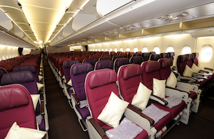 Head rearwards from first class and you find 350 economy seats in a 3-4-3 configuration. However, the scale of the main cabin is broken up as it is split into three zones by a large galley and a large lavatory area. Also, rather than a single seat colour, the three colourways of red, blue and mauve are used, each in sets of two rows to avoid what Salleh calls a “boring monotonous feel”.
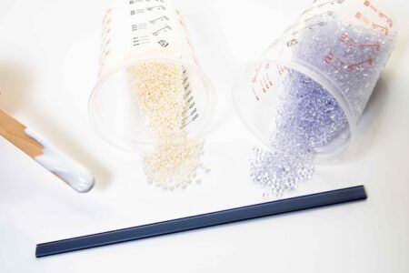
During the delays, the seat specification changed to a Weber model in 2008. The seat is essentially standard, though the dress covers have been stitched into a more quilted pattern to make them look more comfortable, and the colours of the plastics have been changed. Dark purple leather headrests complement the colour of the seats, meaning there is no need for crew to try to align hundreds of antimacassars during turnaround. The leather also harmonises with the leathers found in the first and business class cabins.
The seat offers a 32in pitch and a 6in recline, with the articulating seat pan creating an extra feeling of comfort. “It’s not just a bare minimum tourist class seat; it is comfy, it has a bit more padding, and a bit more space,” says Goode. “You can overdesign things, especially with around 400 economy seats, but the colour blocks break them up and add interest and contrast.”
Economy guests shouldn’t be bored, with a generous 10.6in touchscreen IFE screen to keep them occupied, which does not require a footspace-robbing box – instead it is located under the seat cushion. There is also a USB port and shared power point, and a handset for playing games or calling for service.
We tried sitting behind a reclined seat and can confirm that the seat does intrude into your space, but the high literature pocket means that legroom is not compromised. The seats at the front of each economy section, as well as the exit rows, have very generous legroom, which Malaysia intends to make into ‘hotseats’, which can be booked for an additional fee.
Business is up
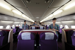 And so, on to business class. Accessed via a wide, straight staircase at the front of the main deck, or via the upper deck doors, this is the only section that remained largely unchanged during the 2008 delays.
If approaching from the stairs, you are first greeted at the top by a granite-topped area with drinks and magazines. In the original design there was a small lounge at the top of the stairs for First Class use, but it was lost in the redesign and relocation of first class, together with the planned bar areas, and entrance areas to each class. Instead now there are two large lavatories either side of the stairwell to the same specification as the lower deck lavatories, and a small office where crew can finish their paperwork, manage the IFE, or adjust the lighting.
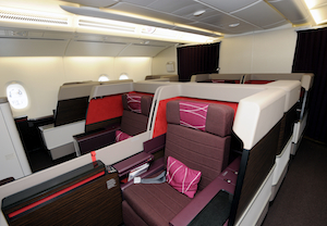
The carpet, armrests and seat fabrics reflect the mauve leathers used in first class and economy, with pale plastics used for the seatback shells to add light and contrast. The Sicma Majesty was selected as the base kinematic for the 66 seats, to which Priestmangoode added an all-new shell and centre console, as well as a stowage compartment for shoes, a small pull-out compartment under the IFE screen, and pockets for magazines, books and headphones. The centre console features a shared wood laminate-topped table and ports for the IFE handsets. “Some airlines want a completely new ground-up new design, others want to take a seat and just change the trim and finish, and then others like Malaysia want to take the basis of the seat and do as much as they can to give it its own identity,” states Goode. “For us that’s important as whoever we design for, the seat must portray the culture of the airline.”
In this case, the airline’s approach of simple passenger satisfaction means no herringbones, no backwards flying, just a simple inline 2-2-2 configuration. There is a real feeling of space in the cabin, and you keep that feeling of space when seated, with a 21in-wide seat, 72in bed and 74in pitch. As with first class, this is much more than on the outgoing 747s, which offer 58in. “Where some carriers are trying to shave bits and pieces off, Malaysia has a really very generous offer,” says Goode. “Some rivals are very tight and measure bed length point to point, whereas Malaysia keeps it very simple and straightforward, with a massive pitch, a large cocktail table, lots of storage, good IFE and a large screen. The cabin looks spacious, which is important for the perception of what you’ll get.”
There are only two criticisms of the seat. The first is simply a product of being inline: there is no direct aisle access for window passengers. The second is more serious: the seat is not quite fully flat. It is still comfortable, but a surprise given the thought put into passenger comfort, and with full-flat business class fast becoming the norm. However, the airline has sought feedback from frequent flyers, and also from Aircraft Interiors International, and is planning to have the seats modified to go fully flat.
Economy laboratory
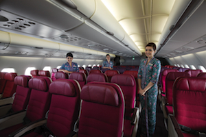 Behind business class is a further economy cabin with 70 seats. This is where you might expect to find premium economy, but Malaysia considered the idea and dropped it, as it is not offered on the rest of the fleet. Instead 14 seats were added to business class, and there are plans to reconfigure again for a further two rows of business class. This area is tranquil and its small size gives it a premium feel, which is why Malaysia is considering reserving it for frequent flyers. There is also extra space and stowage for window seats, created by the fuselage shape.
There are so many possibilities that Malaysia views the cabin as something of a flying testbed for ideas – the current favourite being a premium economy area once it can be introduced to more of the fleet.
“We would like to make this cabin a testbed for a future super economy class product,” states Salleh. “The first step would be to declare it child free, then add extra services such as satays and business class amenities, and charge a bit extra. If we see there is demand then maybe in future aircraft programmes we will seriously consider a super economy compartment. We’re trying to do it in an incremental manner to see if it is acceptable to passengers.”
Ah yes, child-free. This controversial idea is partly to create a desirable area for adult travellers, and also because the space where a baby bassinet would go is too close to a row of business class seats. “Personally I would love to make this cabin child-free. It would be a unique offering,” states Salleh. “It is a work in progress for us to finalise if we want to proceed or not. We are keeping the option open, that’s where we are today. At the moment you don’t pay extra to be on the upper deck, but if it does become child-free we will probably make it slightly premium class,” states Salleh.
The next step in Malaysia’s journey is to recreate the flagship experience onboard its new 737-800s, using the same trims and finishes for consistency across the fleet. The simplicity of this A380 may not have stolen all the headlines, but it may well steal passengers’ hearts.


