When JetBlue began service in 2000, it created a commotion in the domestic US air travel market. The New York-based upstart introduced lower fares than its competitors, new aircraft, leather seats at a generous pitch, and then-CEO David Neeleman had a mission to “bring humanity back to air travel” through core brand values of safety, care, integrity, passion and fun, and a passion for innovation. However, 14 years later, passengers’ expectations of air travel have evolved, meaning it is time for JetBlue to evolve and innovate to differentiate itself in the fierce domestic carrier market.
A prime opportunity to bring in new cabin products presented itself with the order of a new subfleet of A321s, and the airline has really gone to town. With its new Mint product, JetBlue is not just looking to pitch itself as a better passenger experience than other low-cost carriers, but is also looking to poach the legacy carriers’ premium transcon passengers.
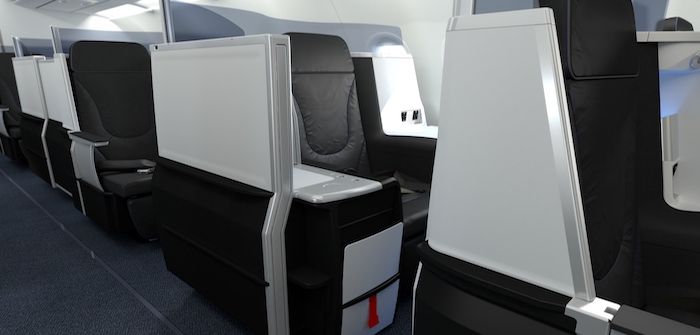
Not only does Mint include 12 lie-flat doubles that are the longest and widest in the US market, it also offers four private suites – a first in the domestic US market. Rows one, three and five in the new A321s are configured 2-2, while rows two and four are 1-1 with private suites – complete with door.
The seat is a heavily customized version of the Vantage model from Northern Ireland-based Thompson Aero Seating. Project leader Don Uselmann, JetBlue’s manager of customer experience, and an eight-year veteran of the airline, explains why they chose a smaller overseas supplier rather than one of the American giants: “Our competitors on the routes the Mint experience will be flying are all using the same off-the-shelf seats in business class. We looked to Thompson because they were willing to work with us to create a fully customized seat. The reason this is so special to us and we think it will shake up the marketplace is that it truly is one of a kind.”
Another reason for the selection of the Vantage is that it offers a good combination of cabin density and comfort for a narrow-body, and only two guests don’t have direct aisle access.
The single seat is included as a result of engineering, not marketing. As Peter Tennent, a director at London-based Factorydesign, which worked with Thompson to create the Mint seats, explains, the layout is a consequence of the architecture of the seat. When Vantage is used in a narrow-body, the feet of the passenger in the suite go into the armrest space of the double in front, so it must be laid out with alternate pairs and singles running down the aisle.
Lone travelers may favour a single seat, which is a great offer in itself. But JetBlue took that product a step further and embraced the idea that some passengers will regard the single seat as superior and proposed the idea of a door to create a private suite.
“That’s the point when JetBlue becomes unique in America,” says Tennent. “That single seat with a door is a substantial offering, even compared to American’s transcontinental first class. In terms of real estate on an aircraft, you get an enormous amount of space.” Tennent is passionate about the suite, referring to it as a “throne” and a “hero product”.
Of course, adding a door means taking away a little space from the passenger, but the generous width of the suite (22.3in in both seat and bed mode, while the doubles are 20.6in with a bed width of 22.6in) meant there was no real detriment to comfort. The only downside of adding a door was a significant amount of recertification work, all handled by Thompson, although no complex issues arose.
Seat comfort is further enhanced by the inclusion of air cushions which offer adjustable firmness, a massage function, integrated laptop and shoe stowage spaces, and a ‘wake me for service’ indicator if the customer chooses to sleep in.
The tables are turned
A key part of the Mint project was a complete redesign of the table arrangement in the double seats. In the standard Vantage, the tables rotate out sideways from the centre console and then bifold, and because two passengers share the center armrest they have to be stacked in the console, which is a complex arrangement.
In the JetBlue design, the two single-leaf tables are relocated to the vertical part of the center console, and when needed, they drop down forwards and then tip sideways towards the passenger. This simplified table mechanism – designed by Factorydesign and engineered by Thompson – is now being integrated into all future Vantage seats.
The tables, as well as functioning better, also enabled the centerconsole’s dimensions to be reworked to allow greater privacy if wanted, while still providing the ability to communicate with one’s neighbor.
“That’s quite a subtle bit of refinement; if you go too high you disconnect them and if it’s too low you don’t provide enough privacy,” says Tennent.
As Tennent adds, “Tables are always an enormous challenge for designers – they are the devil – and successful seats are the ones that deal with that problem among other things.”
Fresh design
The overall cabin design was handled by Paul Wylde, founder of the paulwylde brand and design agency, based in Seattle and San Diego. Wylde’s brief was to help create the Mint brand strategy, to manage the design strategy and creative direction for the cabin interiors – both for new product and refreshing the core product – and to create concepts, ideas and proposals for the overall JetBlue experience on the ground and in the air: what the airline calls the ‘travel ribbon’.
One principle that drove the cabin design was that the front and rear had to be integrated, with a consistent design language. This is because JetBlue wants to ensure that while it is introducing premium products, it does not want to give the feeling of separate classes. Hence there are no divider curtains, as the cabin is about inclusivity not exclusivity, and work focused on how to break up the cabin visually while retaining a sense of community.
Three CMF schemes were developed, and the airline decided to stick with its traditional predominantly gray palette. However, the grey was darkened to a graphite shade, which feels more premium and sophisticated, with color brought in through the translucent blue plastic screens that separate the Mint seats, and through colored seat piping, which also helps to subtly differentiate the seating products – blue in Mint, orange in Even More Space (extra pitch), and gray in the core seats.
“This is where JetBlue differs from Virgin America. Virgin America is like a hip flying nightclub and it is innovative, but does it its own way,” says Wylde. “JetBlue is innovative, but more about the understated performance aesthetic.”
Core product
JetBlue’s core product also received some design attention. The seats are still the B/E Aerospace Pinnacle, and the grey leather the airline was so proud of 14 years ago remains, although in two tones of pale and graphite gray. The seats are well specified, with movable headrests, a 10.1in IFE display, and a decent 33in pitch. Where it became JetBlue’s own product is the seatback, which has been redesigned to look sleeker and feel more like it is part of the environment of the passenger looking at it than sitting in it. The seat pocket has been replaced with a net pocket, and in response to feedback from customers that they would like a place to put drinks when they either don’t want to or can’t use the tray table, a drinks holder was added to hold bottles of water or coffee cups.
The same treatment went into the Even More Space seats in rows 6-10 and 18-19, which are the same product, but with 37-41in pitch, and demarked with orange piping around the headrest.
Marketplace
Between Mint and Even More Space in the cabin lies a really special feature. “Much of our design exploration was about encouraging genuine and spontaneous connectivity between JetBlue crew members and customers. This is what makes the brand so special,” says Wylde. “It’s the humanity, the personality – so design played a big part in enabling JetBlue crew to shine even more than they do now.”
This design exploration centered around what they called an ‘innovation space’ between the middle exits. Ideas explored included Bar 15, an inflight refreshment bar where guests could spend 15 minutes before making room for other passengers; an inflight coffee shop where three passengers at a time could relax with a Nespresso; a stretching space; and an area where third-party sponsors such as Disney or Whole Foods Market could use the area as a promotional space that would also benefit passengers.
However, the idea that made it through was Marketplace, an inflight self-service snack bar. Its first design proposal was as a ‘Gourmet Galley’, complete with bridges, ovens and display systems. However, the design was toned down a little, and a simpler self-service snack bar monument was created in conjunction with Zodiac, with lots of dry stowage space for snacks, and two B/E Aerospace chiller inserts for drinks – fronted by more of the blue plastic.
A great feature, but the best thing is that it is available to all passengers. “This is one of my favourite enhancements,” says Uselmann. “We love getting customer feedback and we heard that they love it when we set up a snack bar in the galley. On the A321s, customers can get a snack while they stretch or go to the restroom – and they don’t have to ask the crew. We are the first carrier to do this domestically and the first to do it on a narrow-body.”
This doesn’t mean the end of inflight service though. Indeed, a snazzy idea being mooted is for crew to change into chefs’ jackets during meal service. It’s a great, simple idea that JetBlue crew love, and hopefully it will happen.
So what else does the future hold? “The big hook for us internally is that we turned 14 in February and you’re about to see a top-to-bottom refreshed JetBlue experience start emerging this summer,” says Uselmann. This includes a new crew uniform design, and a retrofit of the new interiors into the rest of the fleet.
Author: Adam Gavine


