It’s no secret that Iberia has had a few troubles in the past, but IAG has restructured the Spanish airline for greater efficiency, which should see it return to the black in a few years – hopefully along with a recovery in Spain’s economy. However, if the airline is to attract new customers in a reinvigorated Spanish travel market there is, of course, one other element that needs to be in place: new interiors.
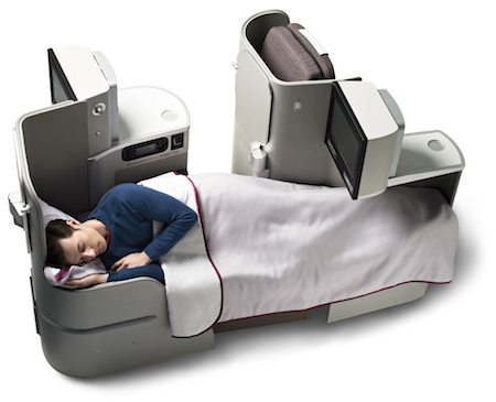
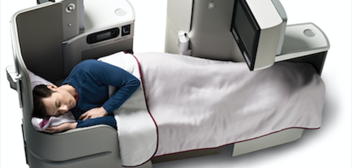
The current long-haul business product, introduced in 2005, is already a good offer, with full-flat beds and more than 2m of personal space. But as Francisca Patilla, Iberia’s product design manager, explains, “As the years passed, we knew there were some features we needed to improve – features that were demanded by our customers.”
These demands included enhanced aisle access, extra privacy and stowage, and improved IFE. And a little added glamour wouldn’t go amiss either. In 2009 Iberia selected the team that would work with its in-house experts to deliver its aims: Interbrand for the brand experience, Mormedi for the industrial design elements, and YourStudio for the CMF.
“Iberia has never really carried out a deep rethink of its brand,” explains Borja Borrero, Interbrand Madrid’s executive creative director of the project. “Because it was a public company, in the past it was managed by engineers. But now the airline feels it is time to bring something new to the brand and to look to the future. We are in the middle of a full reinvention of the brand experience for Iberia – not simply a new cabin experience. The scheme will project Iberia’s new brand into the future and reposition the brand as a new world-class carrier.”
It’s a bold goal, but what specifically did Interbrand want to achieve? Borrero explains: “We did benchmarking and discovered that when you think of Air France, British Airways, American Airlines or Lufthansa, because they are all flag carriers you immediately associate the brand with feelings of the country they belong to. So we wanted to deliver the feelings of vitality and expressiveness that go with the Iberia brand and the Spanish way of life, which is something very powerful and something many envy. We also wanted to match that brand experience with a professional feel on board. It’s not all about siesta or fiesta – it’s about the passion we put into things, the vibrant and energetic way we do things. We wanted to deliver this on board.”
Building business
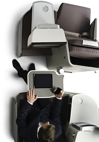 Madrid-based Mormedi worked on the design strategy for the new seats, which involved understanding the airline, what it required, and what its customers want. Following many evaluation flights, together with market analysis and benchmarking exercises, the team put together its proposals for a two- or three-class offer on the understanding that Iberia did not want any ‘blue sky’ seating concepts. Two seats were proposed for both business and economy, with a herringbone and a staggered design proposed for business to meet the direct aisle access requirement, and following thorough evaluation with focus groups composed of Iberia’s frequent flyers, as well as its engineering and maintenance teams, the seat models were decided upon for its incoming A330-300s – albeit with a 12-month delay during the creation of IAG.
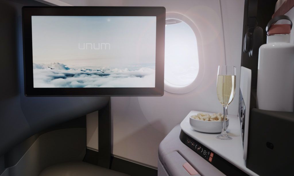
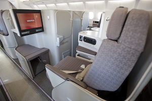 Iberia selected the EADS Sogerma Solstys for business class, and while the airline did not want an all-new seat, it was not an off-the-shelf option either. The standard Solstys has a 73in bed length, and Iberia was adamant that it required a minimum of 76in, so Mormedi set about redesigning the shell – and while making changes, why not optimise a few other elements? Thus the shell was redesigned to give the extra 3in in bed length, and ways to create additional space were examined and implemented, such as moving cabling to free-up an extra 1.5in in seat width (now 22.5in), and also creating space for new stowage areas such as a water bottle holder, while a little more room was found in the footwell. The armrest was also redesigned to go down as well as up, adding a little more width in bed mode. The product is finished with a 15.4in Panasonic IFE display, which will be complemented by GSM and wi-fi as soon the relevant permissions are granted by DGAC, the Spanish civil aviation authority.
“Even though we started with defined kinematics, we created a completely new shell and that gave us an opportunity to make a new seat,” explains Jaime Moreno, CEO of Mormedi. “It is easier when you have the kinematics from the start, but it does make constraints. It was a tight programme in terms of delivery time, so there were some issues we could not change as that would have required recertification of the seat, which would have been impossible in the deadline.
“A blue sky project it is more exciting for designers, but the objective from the beginning was to make the product better with a longer bed and wider seats, to increase privacy, and to give everyone direct aisle access and extra stowage, and we achieved that.” Better still, Mormedi ensured that the redesigned Solstys would not cost more to buy or manufacture.
“Those improvements were very important for us and there was room to make them, so we thought it was a great opportunity to include them and fulfil all our customers’ needs,” adds Iberia’s Patilla.
Stronger economy
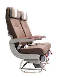 Interbrand noticed in its research that there was a huge difference in the passenger experience between the outgoing business and economy cabins, and decided to make the economy experience a little more energetic and closer in feel to business. “After all, many people who fly business class also fly economy class on their holidays. So we wanted to make the experience not so dramatically different,” explains Borrero.
Again, the seats – from Zodiac Seats France (Sicma) – were not extensively modified by Mormedi, but they did receive careful attention all the same.
“I think the standard seat is good in terms of comfort, and the seatback looks modern, but the armrest looks old and heavy – like a 10-year-old design – so we pushed Iberia to let us customise it. We gave the armrest more curvature and made it slimmer, which also created more space,” explains Moreno, who also updated the end bay. The new Panasonic eX2 IFE also meant that Iberia could answer customer demand for individual touchscreens.
Speaking of the overall seat project, Moreno adds, “We showed we had good technical knowledge and that our proposals would not cost more to manufacture. We had a good relationship with Sicma and Sogerma after this project as everything we designed was feasible. And they recognised the improvements – the economy seat looks much more modern and the business seat is much better in terms of space and comfort. In the end, both vendors were happy with the results.”
Colours and materials
According to Iberia, the cabins had to give a sense of attention to detail, tailored style and the “art of flying”, while also being internationally recognisable, stylish and premium, enhanced by colours that give a dash of Spanish vitality.
Interbrand explored colours and textiles to find the right feel that would meet the brand strategy and create a new brand experience on board. The team established colour palettes and values that would be delivered throughout the Iberia experience, and also created several exploratory studies and mood boards with patterns, graphics, photos, renderings and other visual elements.
“We didn’t want too colourful an experience,” explains Borrero. “We wanted an elegant backdrop on top of which we could add splashes of colour and ideas that give the feeling of being passionate and expressive. We didn’t want to saturate the fun idea, we wanted it to feel professional while also giving hints of fun and delivering a great experience. By choosing flashes of colour we delivered this, but it’s not all over the place, it’s not overdone.”
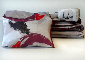 The result is that the predominant tone in business is a mid-grey, a relaxing shade that makes the stars of the flight experience – the passengers and crew – stand out. It also means that the cabins will not soon go out of fashion, and current trends can be addressed by updating colourful elements such as cushions, blankets and amenities.
Interbrand did a great job in defining the brand’s visual expression, but it wanted some assistance in translating those ideas into reality, and turned to London-based YourStudio. This relieved Interbrand of a large workload as CMF is an area in which – and this project was no exception – anyone can offer an opinion. However, the YourStudio team retained control by presenting its vision of the perfect cabin in terms of CMF and only then inviting opinion.
“One of our guiding principles from the beginning was that even though we wanted to create the ‘wow’ factor when passengers enter the cabins, we wanted something that wasn’t gimmicky, that felt really tailored and sophisticated,” says YourStudio director Howard Sullivan. “Because these are predominantly long-haul aircraft, the passengers will be there for around 10 hours, so they will very quickly tire of anything too flashy. We wanted to create something with a little more intrigue that develops your interest as you go through the journey.”
Thus, while sitting in business, you will have around 20 different materials and finishes within reach, from rubber strips, to soft touch, semi-matte and lacquered paint finishes, to different grades of leather and ultrasuede, to different weights and textures of fabrics. Eight hours into a journey a passenger might reach down to pick up a magazine and discover a leather finish by the footwell – an unexpected surprise that reinforces the feeling of quality.
“When on an aircraft, everything you touch should represent quality because you’re up in the air. The things you touch or rub against should feel solid, so you feel solid and safe. It was important to us for it to be a really tactile experience,” says Sullivan.
For textiles, months of work went into experimenting with various mills to achieve interesting textures while remaining subtle – and aerospace compliant. In this field a further expert – Emma Rickards from West 6 – was brought in. Rickards has worked with YourStudio previously on projects such as British Airways and Cathay Pacific lounges, and was brought on board due to her good relationships with mills, suppliers and manufacturers, and her knowledge of selecting and creating materials, trims and finishes to airline specifications.
The scope of textile influences went beyond supplier catalogues and airline inspiration. YourStudio carried out an audit of materials used in the fashion industry, with particular favourites being those of Mulberry and Lanvin, while they also looked at traditional fabrics such as herringbones and tweeds. “Our roots were driven by classic fabrics as we wanted to create a modern classic,” says Sullivan.
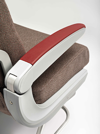 Clearly there are fewer finishes to captivate the economy passenger, but the teams still wanted the feeling of quality to feed from business to the main cabin, so elements were added – including a red leather trim on the armrests, with a nice metal detail round the edge – so that all passengers feel the attention to detail.
Red stitching is used in both classes as a subtle nod to Iberia’s brand colours – as a cricket-ball stitch in business and a simple running stitch that follows some of the seams in economy. The red elements have been kept deliberately low-key as it can be quite a ‘sharp’ colour for interiors, but the teams felt it was important to feature it in some subtle way. “It was a way of showing that where you see the Iberia red, it is signalling a nice detail,” adds Sullivan.
Finishes
It is not just the tactile qualities that endure during flight, as the various paint finishes react differently to different angles and intensity of light. One of the finishes that really impresses is the laminate on the seat shell. As you walk in the cabin, taking in your surroundings and under the bright boarding lights, you will just notice pale grey shells. But as the natural light and the LED mood lighting changes during the flight, you will notice that the shell is actually finished in a subtle dogtooth print of warm silver against a slightly colder silver grey, with a soft sheen.
This is no off-the-shelf finish. The idea actually stemmed from matte-metallic paint finishes from the likes of Mercedes-Benz, that the YourStudio team noticed at the Paris Motor Show. The idea was worked on and refined, and a unique shell finish made specially for Iberia.
“It graces the seat with the light and gives you extra dimensions that come alive as light moves around the curves of the seat and as you move around the cabin. We tried not to use flat colours wherever we had the opportunity not to,” says Sullivan.
The future
Iberia and its design partners are not finished yet. The new cabin designs and seats are also being retrofitted to the airline’s fleet of 17 A340s, the first of which will be complete in June, with the rest of the Airbus fleet to follow by the end of 2014.
Beyond that, new lounges are literally on the drawing board, and the livery may receive some attention. Clearly the livery is a major element and a big decision, and Interbrand is being cautious, with Borrero saying, “At this point we are looking at several solutions. The livery already has strong visual equity in many markets, so we haven’t made any decisions yet.”
“We are in the process of redesigning our brand, but
we are not in a position to talk about the timing,” adds Iberia’s Patilla.
However, Patilla is in a position to mention the customer feedback from initial flights with the new interiors, saying, “Our customers’ reaction has been fantastic in relation to both cabins. To be more specific, the surveys conducted among our customers so far show that our economy class is now among the three best economy long-haul cabins. This encourages us and shows that our effort has been worth it.”
