The definition of a galley: ‘A kitchen in a boat or a ship and an aircraft. It is usually a narrow passageway between two walls, traditionally with a sink on one side and storage.’
We can understand why the zone in an aircraft that is dedicated to food preparation is called a galley, and usually the two opposing walls that house the carts are a familiar sight every time we board a commercial aircraft. I think you’ll agree, it’s not the most aesthetic welcome aboard.
The collection of disparate galley carts is the worst zone of an aircraft and reminds one of the view down an alley behind any hotel or restaurant, where the wheelie bins sit in formation showing the scars of a hard, uncared-for life. No two are ever the same and the damage, stains and stickers make it hard to distinguish what is trash and what is dinner.
It is understandable that these zones are located close to doors so that access is unhindered, but unfortunately the galley is often also the boarding reception area, and thus the first impression at the beginning of a long trip and for a ticket price that even in ECL (economy class if you are reading this in your dentist and wonder what I am talking about) is many hundreds of pounds, euros or dollars.
This is not applicable to short-haul flights of 2-5 hours on single-aisle aircraft, but even these types of flights could do with a serious review of how to create the illusion of the airline actually caring.
Many airlines clearly don’t care, so as the trolleys are pushed up the aisle to deliver the food shown in the inflight magazine, passengers then realize that the 6 x 4cm picture of the dry-cured meats, crackers, cheese and an olive was actually to scale! Generosity is not the objective. Indeed, some inflight refreshments are shockingly bad, and very expensive to boot.
Does it really have to be like this?
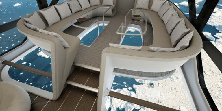
Recently we at Design Q embarked on a project that allowed us to think outside the box (or cart) and investigate a way of providing an experience that has never been truly achieved on a commercial flight – a place of sanctuary that can replicate the experience of a local coffee shop or bistro. The program is for the world’s largest aircraft which, over the coming years, will become the world’s largest first-class luxury hybrid aircraft. Named the Airlander 10, the airship combines some aspects of an airship with all the practicality of helicopters and fixed-wing aeroplanes, and it will provide unique experiences such as hovering over the ocean to watch the natural spectacle and marine life below: feeding humpback whales breaching the surface, watching manta rays gliding over the waves, or watching gannets dive on a huge shoal of herring, all while sipping a gin and tonic and looking down upon the most hard to reach wonders of our spectacular world.
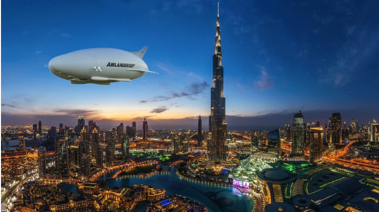
I must be honest at this point, because designing for this type of aircraft provides some alleviation in certification requirements compared with airplanes. The top speed will only be around 90 knots, so no 16G certification is needed, which does give us much greater freedom to invent new spaces. Having said that, we have discovered in the 22-year history of running our studio that revolutionizing one thing often leads to significant progress in other areas… so, hybrid aircraft today and airliners tomorrow!
Memorable experiences
Bar areas are not new on long-haul aircraft, such as Virgin Atlantic’s Door 2 areas on its Dreamliner fleet. I remember well a flight in 2010 with Virgin Atlantic when at 2am I sat at the bar with my then three-year-old daughter Lilly (who wouldn’t sleep), her with a Knickerbocker glory and me with a double single malt. You can tell I took my parental responsibilities seriously! It turned out that the guy chatting to us at the three-seat bar was a young dynamic Disney executive and, two days later, totally out of the blue, Lilly received a package at our hotel containing a family unlimited passto Disneyworld. She had clearly made quite an impact! The look of sheer joy on her face was something I won’t forget.
His generosity made a big impression on me and I realized that none of that would have happened had it not been for the environment created by Virgin. At the time Virgin were at the top of their game.
The difficulties are clear with space restrictions and TTL requirements, so for Airlander 10 we looked at ways to create a bistro coffee shop feel with a bar stool arrangement. It does make a great deal of sense to incorporate an espresso machine and tea making in a way that temps us and makes us happy. Likewise, by having the same area doubling as a bar, or somewhere to sit or stand and chat, to take a break from the 5×2 ft enclosure if you are in economy, or 6.5 x 3ft in business.
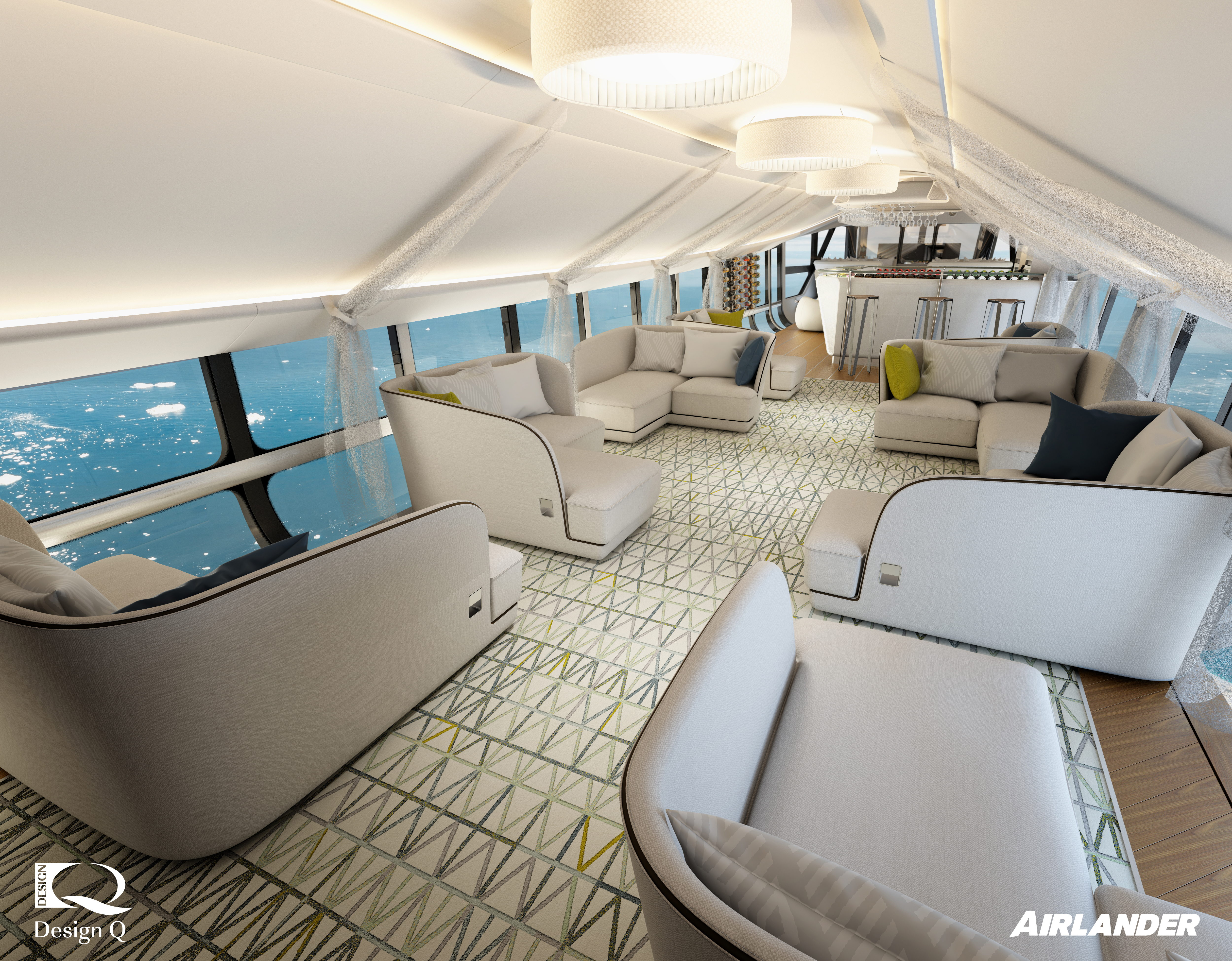
The bar with the ultimate view
Our focus is to display and cater in such a way that the equipment becomes part of the décor, something to be admired and not hidden away in a tatty galley. Coffee machines are wonderful things, although some more wonderful than others in term of their design – and indeed their coffee-making abilities.
Our wish list starts with a to-die-for polished stainless steel three-nozzle machine taking pride of place, which is designed to make you want a proper cup of coffee. The more gauges and pipes and handles and controls the better! Something that looked as if it belongs in your favorite Italian coffee shop.
I’m an unrepentant analog man. I prefer my watches without batteries and the same goes for cars. There, I’ve said it, and now you know me a little better. We live in such a digital world, and sometimes it is great to take simple pleasure in watching a mechanism do its job very well.
Design Q bought a commercial espresso machine, took it apart and slowly rebuilt it to certify it for commercial flight. This beautiful yet familiar machine becomes the focal point of the bar and seemingly has its own 3m x 3m zone, the zone of reassurance if you like.
The next big ‘wow’ comes from the design effects used in many of the best contemporary bars, namely using clever lighting to filter through the 12, 20 or 50-year-old bottles of Scotland’s finest malts, England’s finest gins and Irelands gentle whiskeys and stouts, not forgetting French wines and brandies and American bourbons and beers. Indeed, this zone is open to all those territories that produce world-class beverages, with the bottles all skilfully displayed so customers can anticipate the delight that lies within. The cascade of colors, light and shapes turns the bottles into optical masterpieces with branded labels that look like they’ve been around for over 300 years, stimulating the eyes.
A luxury galley
The clean layout of the Airlander 10’s galley allows for two adjacent worktop areas and, in this case, approximately 3 square metres of worktop and two end sinks. There is storage space to display 45 bottles, and refrigerated storage for a further 24. There are also two food refrigerators and two combination oven/microwaves, two 19-piece crockery sets and storage cupboards and drawers
A dedicated trash zone is hidden from view, while the overhead rack for drinks glasses contributes to the light show, with cleverly placed LEDs shining down through each glass, making it the most stunning aviation chandelier on the planet.
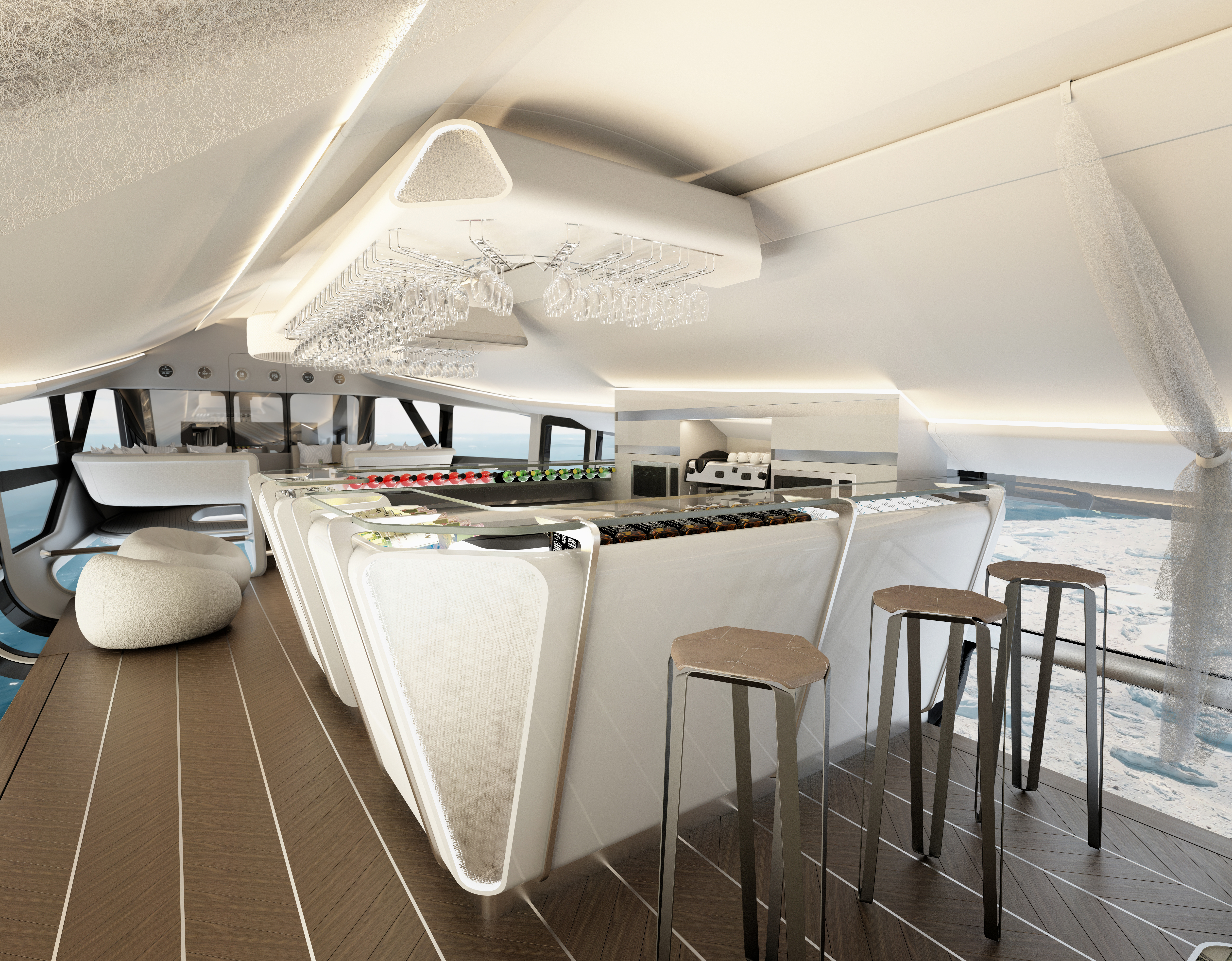
The most important point here, and the last thought for this article is that this zone is not only fit for purpose from a drinks and food preparation standpoint, but it becomes a coveted place to linger as a traveler and to enjoy an occasion that adds to the list of life experiences that are fondly remembered and talked about for the rest of your life. A good life is made up of experiences like these.
Looking to the future, we are already incorporating some of the design philosophy from our Airlander experience back into mainstream aircraft, working out clever ways to incorporate the necessary practical stuff whilst accentuating the traveler’s enjoyment of the journey. Daughter Lilly would approve…
For more details of the Airlander 10 passenger experience, see our feature HERE.

Design Q is an independent design consultancy based in Redditch, just south of Birmingham in the UK. Founded in 1997 by Howard Guy (pictured left) and his fellow ex-Jaguar designer, Gary Doy, they have gone from strength to strength and have built up an enviable portfolio of product designs ranging from aerospace interiors, car exterior and interiors, as well as various consumer durable products.
