Etihad’s recently unveiled A380 interiors project is one of the most impressive airline schemes of all time. It is not just the luxury appointments that inspire, but the sheer depth of design and engineering – and the fact that the many NDAs in place all held fast for five years.
In 2008, Etihad invited pitches for an A380 interior project, from established aircraft interior design specialists, from boutique agencies, and from agencies that don’t specialize solely in aviation, as they wanted to hear a diverse range of ideas. The panel was presented with all the highly engineered proposals and the more left-field ideas they could wish for, and found that choosing just one was a difficult task. As they considered the shortlisted bidders, they did find a solution to meet their needs though, as Peter Baumgartner, Etihad’s CCO recalls: “We said, ‘Guys, we made a decision, it’s not you, it’s not you, it’s not you – it’s all of you. We now want you to go back home and come back to us with an integrated proposal’.”
The parties agreed and the Etihad Design Consortium (EDC) was born, comprising three agencies with bases in London: Acumen Design Associates, Factorydesign and Honour Branding. Acumen applied its aircraft seat design and innovation experience; Factorydesign worked on the passenger experience and cabin interior elements such as galleys, lavatories, stowages and passenger destination zones; while Honour coordinated the project across the EDC, and helped to define the innovation process and design strategy to inform the concept work. To simplify communication, Mike Crump, a partner at Honour Branding, was appointed as the main conduit between Etihad and the EDC.
Baumgartner hails the team’s work “a complete success”, but it was still a hands-on project for Etihad, whose guest experience, cabin interior and technical teams were heavily involved. As Baumgartner says, “If you have such high ambitions and aspirations, then you can’t just leave it in someone’s hands and say, ‘See you in five years’. You have to lead very strongly from inside.”
The team went through an ‘immersion phase’ in Abu Dhabi to understand its culture, its increasingly modern approach to design and architecture, and to appreciate why its national carrier is a key part of the Abu Dhabi 2030 Vision.
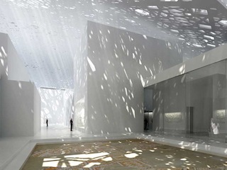
Renderings: Copyright Ateliers Jean Nouvel
Abu Dhabi itself was a big inspiration for the design – from the soft furnishings, materials and finishes, to the creation of spaces. Big influences were Abu Dhabi’s drive into art and design, including the future opening of Guggenheim and Louvre (pictured left) galleries; Abu Dhabi’s unique position of greening the desert; the heritage and connection to the desert; and traditional Arabian hospitality, in which social, family and work life blurs together.
However, as the research grew, the project grew and new depths of requirement were added throughout – including adding a Dreamliner interior to the project (see page 32). Indeed all parties agree that Etihad soon became the biggest project they had ever worked on, effectively becoming eight major projects to complete in five years, between all the classes and monuments. The result, however, is the most customized A380 and B787 interiors in the world, with the aim of being the best in the world.
The big picture
Etihad really was a clean sheet project – or perhaps ‘empty shell’ would be more appropriate as the team started work from the bare skeleton of the A380, and by the end of the project had made over 400 revisions to its LOPA.
As Ian Dryburgh, CEO of Acumen says, “Acumen embraced an intensive six-month blue-sky concept phase – turning the whole company into an Etihad ‘think-tank’. The net result was a mass creation of hundreds of ideas spanning YC/PYC/HDBC/BC/SBC/FC/SFC and VIP solutions”. Acumen’s vast range of seating ideas were eventually whittled down to just four in each class, with the final concepts selected by Etihad.
The idea of a luxury suite – now dubbed the Residence – was considered early on for the A380, as a two-floor space with the living room downstairs and a bedroom and shower room upstairs. Some of these early cabin interior ideas considered removing the front staircase, which was not considered a great loss as it is not required for crew service and can’t be used by passengers during flight or indeed boarding. However, Airbus said the staircase was structural and would require a substantial redesign to remove.
Thus the decision was made to split the aircraft lengthways, with the upper floor for the premium cabins and the main deck for economy – an idea also influenced by the ability to board the upper deck from the premium airport lounges. It was also felt that this would be culturally more acceptable and reflected how luxury hotels segregate their premium offer on higher floors.
As Adam White, director of Factorydesign, explains, “The A380 is effectively two different aircraft: a luxury private jet above and the very best commercial aircraft below.” The two decks are entirely separate as far as passengers are concerned, especially as the method of boarding means they will not mix. Even the front galley lift has been removed, as it was not needed for the service, and gave greater flexibility to the design of the galley and door welcome spaces.
A grand entrance
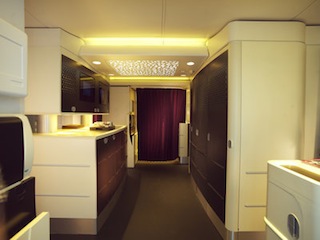 Research pointed to the high level of expectation on entering the A380, and an EDC study of aircraft entrances that were flying at the time highlighted great opportunity. What they wanted were entrances that had ‘wow’ factor; that felt like entering a boutique hotel. This intention has almost become a cliché in recent years, but the EDC had in-depth talks with Etihad and Airbus to see how they could manipulate the A380’s structure and layout to bring this feeling to life.
Some brilliant ideas were discussed, including galley units on the main deck that could be moved during flight to create a flexible space, and even units that could be collapsed down to create more social space when not in use. According to Crump, the suppliers were keen to make the ideas work, but as the commercial reality of the aircraft drove more seats to be added to the main deck, more trolleys were required, which meant more traditional monuments were required to accommodate them.
The galleys are far from traditional aircraft fare in design though. The galley work was undertaken by Factorydesign, which designed some pieces worthy of the fabled hotel, featuring dark wood fretwork panels, screens and doors. To create a genuine hotel feel, it was important to remove all parts that felt more aerospace than luxury space, such as aluminum extrusions, obvious bump strips, inconsistent and ugly latches, and exposed hinges.
This was an approach followed through on all aspects of galley and stowage work, whether BFE or SFE. It was a major undertaking of coordination and effort to create an interior that was truly considered as a whole, not a series of parts, on both decks.
The team worked with Sell (Zodiac Premium Galleys) to design cleaner, sleeker galleys that challenged previous norms. The team had to prove that its designs would meet all engineering, manufacturing and certification requirements before any work began – a recurring theme during this project – and happily the sleek galleys with their smooth edges and soft radii worked at every level and ultimately passed every test; indeed the first units are being delivered at the moment.
The main lower deck economy entranceway offers a boarding experience superior to that which many first class flyers experience. The wide space has a series of doors over the galley on the right, which are closed during boarding to maintain the hotel feel, and fold back during service to reveal the trolleys and galley inserts. To the left is commercial aviation’s first visually separated galley, with the lower level concealing trolley space, and the upper level concealing further stowage, with two glass-fronted doors framing a pair of monitors.
The space between the levels provides a large work area and adds to the feeling of space and light, especially since it is fitted with electronic double-layer shutterglass. During boarding and deplaning the glass is clear, but at night when crew need to work in the galley or passengers wish to socialize in the space, the glass darkens so the light does not disturb the slumbering passengers beyond. This feature is used in other areas as well.
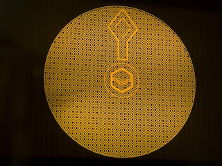 Other features of note are a unit with a flat dedicated area, which can be used as a small social space, and to demonstrate items from the duty-free catalog (the few catalog items you’ll find on Etihad’s new aircraft). Shopping items are also showcased in a glass-fronted cabinet above. And in a clever use of dead space, the areas by the doors have curtains, which can be drawn to create a private prayer area, complete with a prayer rug and a Qibla finder linked to the aircraft’s navigation system, which shows the direction of Mecca (pictured above).
Entering the top tier
The forward upper-deck entrance gives passengers even less of a clue as to the space’s core function. A dark wood cabinet with a white granite work surface is all they see before turning left into the first class cabin. Turn right and they pass a unit with latticed blinds similar in detail to the doors downstairs to one side, while to the left the unit also features secure glass-fronted units which potentially will display genuine works of art and antiquity on loan from Abu Dhabi galleries such as the Louvre or Guggenheim, and monitors showing welcome and promotional videos.
So where are the first class meals prepared? The simple answer is, any galley work that might let the mundane spoil the premium experience or risk the crew getting in the way of passengers, is carried out in a second galley located parallel. The complicated answer is, this is the first time an A380 galley has been fitted in this direction, and it called for some major structural work – especially since this is a 2.5 metric ton galley area. The EDC did some extensive work with the Airbus structures team to optimize the position of the galley, and the floor had to be supported in a different way, with extra carbon fiber reinforcement. This involved years of work, as whenever the galley moved there were many implications, such as hot oven exhaust gas ducting complications, but all parties felt that creating a private galley area was a crucial part of creating the ultimate experience.
As Peter Tennent, director of Factorydesign, says, “The attention to detail of the EDC and its drive to pursue details and get them delivered was key. Every designer can create a vision, but it’s the determination to implement those details and maintain the integrity of the original source that is key.”
The Lobby
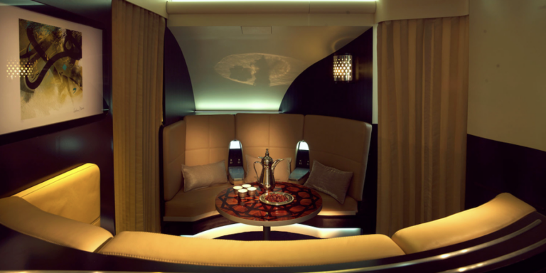
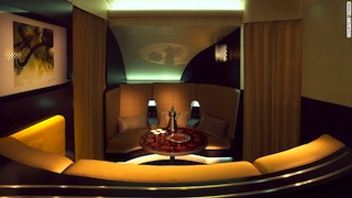 Beyond the galley, heading aft, is the Lobby lounge area, a space made possible due to the rotated galleys. Its location between first and business class was carefully considered, as research found that first class passengers tend to prefer staying in their suites, while business passengers like to move around – but it gives another option for all upper deck guests. This is an exceptional, high-quality space, created in conjunction with Zodiac Aerospace. Until the final stages of the project, the area was known as the Majlis, after the Arabian spaces where guests are received and entertained. As the A380 approached launch, and in keeping with the boutique hotel feel, it became the Lobby.
As Fiona Morrisson, Etihad’s VP of guest experience, explains, “If the A380 is a boutique hotel, then this is where you can hang out, socialize, or just get away from your seat. It came from insights into how people want to congregate and what they want. They want a bar, but they don’t want a bar that isn’t quite a bar, and we wanted to create a unique environment.”
To create that authentic bar feel, Etihad wanted the various bottles to be on display at all times, so the bar unit was designed with special holders so the wide range of spirits can remain in place during take-off and landing. The curved glass stowages to the sides add to the feel of a cocktail cabinet, and in themselves represented two years of work. Adrian Berry, a director at Factorydesign, is especially fond of the result, calling it “a piece of solid, machined wonderfulness”.
Guests can lounge on the Poltrona Frau leather-upholstered sofas, play cards on the 27.6in-diameter marquetry table (folded and stowed in a compartment behind the sofa when not in use), order a drink from the bar and lean on the bar surface behind the sofa, watch sport on the 32in TV, hold a meeting – whatever they would like to do in this relaxed space. Current plans for the space include social events such as high tea, and themed events – strawberries during Wimbledon perhaps.
Moonlighting
Of note throughout all these spaces are the light features. The ceilings in first class and the PSU channel in business class have been completely redesigned to accommodate light panels that cast a dappled light on the floors and walls, similar to moonlight cast through the fronds of a palm tree.
The effect is soft and makes the spaces feel larger and less tubular… but it isn’t created by those large light fittings, as they do not generate sufficient light to cast an image on the floors. Instead they cast a gentle light that fools the eye, while a second Gobo light projects the image. In addition, a special feature ceiling in the economy entrance was developed with AIM Aviation. The lighting effects – called the Lights of Abu Dhabi – help make the Etihad experience unique and will become a key image in the airline’s marketing campaigns.
“A lot of thought went into lighting as it is an interesting opportunity to create a different feel. Lighting is an area you can own,” says Morrisson. “The goal was to play with lighting and use it to our advantage and make the entryways less sterile. We will also have custom mood lighting in first class to create dawn and dusk effects, with the Lights of Abu Dhabi projected down the middle of the aisle. This is not an Airbus catalog item and it makes it our aircraft. The light was a major investment but when you walk in you’ll go, ‘Wow.’”
First Class Apartments
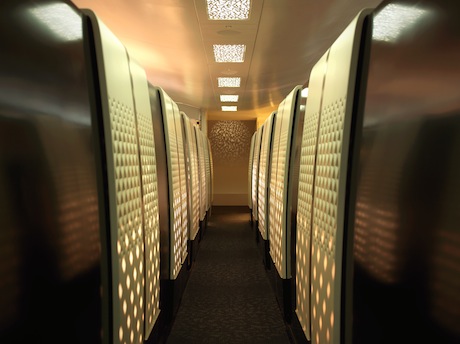
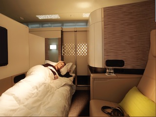 Etihad and the EDC decided that in order to create the world’s finest first class cabin, they would make it single aisle, giving the aisle space back to the customer. This change in proportion allowed Acumen to create an environment more akin to a hotel room. The central aisle raised a certification issue regarding the crew having a direct view down the aisle, so a crew seat had to be integrated into the galley complex. Indeed with so many new and challenging features, some certification rules have actually been updated as a direct result of the Etihad project.
For the nine first class suites, being marked as Apartments, the EDC’s research found that passengers would prefer a separate seat and bed. They also preferred private suites, which require double doors for certification, which in turn generated some geometric challenges. The final design you see here – and indeed in every class – is a direct result of research carried out during the design phase, when interviewees were asked to select their favorite from four options.
The walls of the 39 sq. ft suite are 64in high, so it takes a deliberate effort to peer over the side, although crew can bend down and peer through the fretwork pattern in the doors to ensure everyone is safely secured during turbulence. The 30.3in-wide seat reclines just like a classic lounge chair with an ottoman, moving to a ‘lazy Z’ position, and there is room for two companions to join you on the ottoman opposite without knocking knees.
Come bedtime, the ottoman slides and rotates to create the bed, the mechanism for which is an industry first. “The challenge was to design a structurally sound kinematic that could transform an 80.5in-long ottoman into a 26.5in-wide bed and package it into a 1.5in-thick envelope, while maintaining a clean and consistent aesthetic in either state,” recalls Anthony Harcup, Acumen’s design lead for the Apartments and Residence. “We developed a few iterations of the mechanism and built a fully powered working prototype in the final mock-up to prove the principle and test the ottoman-belt-retraction mechanism before handing it over to the manufacturer.”
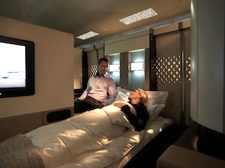 Six of the nine suites can transform into double suites, so if you are traveling with your neighbor, you can retract a discreet screen to reveal the adjoining apartment. Over 75% of the suite geometry consists of doors, panels and assemblies which slide or move mechanically, and new mechanisms were designed and developed from scratch to facilitate a number these unprecedented conditions.
Other features in the Apartments, which were created with B/E Aerospace, include a chilled minibar using a non-mechanical Icebridge cooling system, a large drawer for shoes and bedding, space under the ottoman for a cabin bag, and a pop-out bedside table for a water bottle.
To ensure the 24in Panasonic eX3 TV can be viewed in different seated and in-bed positions, a completely new monitor mechanism was developed which can rotate the monitor 90°, transport it 8in toward the passenger and cantilever it over the bed. The mechanism is packaged within a depth of just 1in, and the team had to ensure that when fully deployed, the monitor can withstand a 300 lb abuse load and still be able to stow.
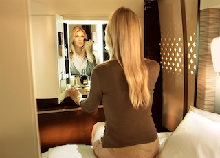 Sometimes guests feel guilty about taking their time in a shared bathroom (there is a first class lavatory and shower room at the front of the cabin), so a nice feature is the vanity unit in each suite, which, when opened, reveals an illuminated space with a large mirror, stocked with inflight amenities and a shower kit. One idea considered, but later dropped, was to include a sink in the vanity unit.
The Residence
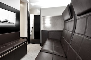 The Apartments are undoubtedly world-leading, but Etihad has gone a step further in creating its Residence halo product. The entrance is subtle, appearing just like the other first class suites. As Morrisson explains, “The Residence is meant to be the ultimate in discretion. You can board when you like; whether first or last, it is customized to your need. You enter on the top deck and only pass the other first class seats, so if you’re a celebrity or a head of state, you probably won’t be spotted.”
Step inside and the space is similar to the Apartments, only there is a 60.4in-wide two-seat sofa instead of an individual seat and the ottoman does not convert to a bed. Having two people sharing the space during TTOL was a major challenge, which took a year to get through EASA approval – work that may benefit rivals in their future plans. With approval gained, the Residence is similar to a hotel room, in that one price is charged, but two people share the space.
There are three color and finish schemes on the 10 A380s that will carry the Residence, each with different carpets, leather colors and marquetry, and each giving a slightly different experience (one is a take on traditional Arabic woven carpet, one is a modern design, and one is a design inspired by the Lights of Abu Dhabi). The initial plans were for each Residence to be individual, but with each scheme having to be certified, and the complex logistics of requiring spare parts for 10 different schemes, it was reduced to three (there are also three different trims for the Apartments).
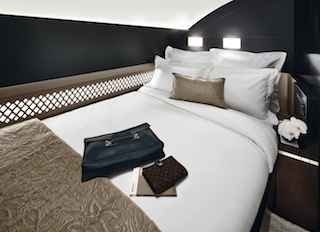 Step through the internal door and a corridor leads to a shower room and bedroom. This space is often used by airlines as a small lounge or dressing room/lavatory, but with a shower room opposite and a great lounge at the other end of the aisle, monetizing this space made more sense – and creates an amazing 125 sq.ft halo product.
Under the 82in-long, 47.5in-wide bed is stowage space for cabin bags, and once in the bed, there is a 27in TV to watch and a bedside table on which to rest a drink. It was a challenge to meet the decompression requirements of the bedroom while maintaining the aesthetics, privacy, and usability of the bedroom door, so a new blow-out latch mechanism had to be designed, which is engineered to fail at a specified pressure.
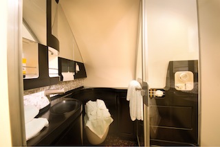 The shower room, created with Diehl, has a lavatory and a vanity area around the sink, complete with towels, a hairdryer, and all the accoutrements you might need after a night’s sleep. The shower head is mounted in the tallest corner of the cubicle and is high enough for a 6ft-tall passenger to enjoy the four-minute cycle. With a full-length wardrobe concealed in a recess in the corridor, Residence guests can have a great night’s sleep, shower, get dressed and enjoy breakfast, ready to get on with their day as soon as they land.
When Etihad informed Airbus that it wanted showers, it was initially offered an existing unit and an option of some visual customization. However, the EDC wanted a different footprint in its shower rooms – and for its showers to be the best – and it believes this has been achieved. The position of the lavatory also created a lot of work. When one of Etihad’s research projects raised the idea of installing the toilet in the corner, the idea was seized. However, making the design a reality involved proving to Airbus the design would work, and even redesigning the plumbing system.
As Morrisson says of the Residence, “This is a truly aspirational, truly unique aviation experience.” This is especially true when you consider that the Residence also has a dedicated butler, together with even more options to customize your experience. As well as boarding whenever you like, you can have the minibar filled with whatever you like, and have any special catering requests attended to, provided notice is given.
Business Class
Beyond the Lobby is business class, featuring 70 Business Suites from Sogerma, which boast 20% more space than the current Solstys seat. These spacious suites are configured 1-2-1 in a fore and aft dovetail, all with direct aisle access and an 18in IFE display. Acumen was tasked with creating a business class seat that is not just the best in its class, but even superior to some rivals’ first class products.
A double curvature on the aisle-side panels creates more space at foot and shoulder height when walking down the aisle, giving a greater impression of space in the cabin environment. For the internal design of the Business Suites, Etihad’s extensive research found that privacy was considered a priority. Thus the forward-facing seats down the center are divided with a full-height electric dropping screen which can be controlled by either passenger to create an open space for a more suite-like environment. The aft-facing seats have a sliding aisle screen to block them off from the aisle and for extra privacy when sleeping. The seat backrest height and suite height is 48in, which is relatively high for a business class product and enhances the feeling of privacy, personal space and luxury.
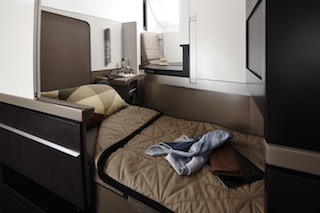 The 22in-wide seats are trimmed in Poltrona Frau hide, and there is a slight advantage in bed length for forward-facing passengers, who get 80.5in as opposed to 75.7in. To enhance the dining experience, large surface areas have been specified on which to rest items such as laptops while eating, and the 16 x 18in dining table slides in and out.
“The table was a major challenge,” states Nigel Lawson, a director at Acumen. “Our aim was to create a table design that was as simple and as intuitive for the guest to use as possible. From an engineering perspective, the packaging and design of the table was challenging. We wanted the interface with the guest to be as ‘furniture-like’ as possible; however, in order to meet all the functional requirements, the underside is very complex.”
Stowage is generous, with overhead bins, space under the ottoman for a carry-on bag, and a side stowage cabinet.
As with the showers in first class, the business class toilets were completely reconfigured to provide corner toilets, to maximize space, and to harmonize the premium sector feel of the rooms on the upper deck.
Economy class
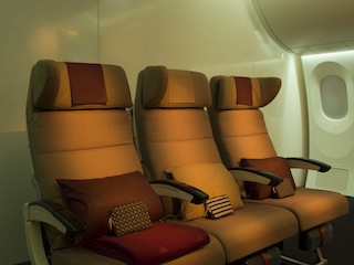 Once beyond the striking entranceways, the all-economy deck may seem a little ordinary, with 417 seats in a 3-4-3 configuration. Etihad’s original intention was to create an innovative seat and have it manufactured, with ideas including having seats in quads so guests could enjoy a Majlis, some staggered seating ideas, and even the notion of having beds in the ceiling void. However, this was an area where Etihad had to concede defeat, as such innovation was not possible in the given timeframe.
However, Etihad still wants this to be the best economy class in the sky. The Weber 5751 seat was decided upon as the best seat on the market for this application, with an inflatable lumbar, and customized seatback, end-bay and headrest. The EDC found that economy passengers wanted some privacy, and within this compact environment, the idea of headrest ‘ears’ arose. The headrest – trimmed in camel leather – has one fixed wing to rest your head on, effectively giving everyone one of the main benefits of a window seat, while the other side can also be bent round to fully hold the head. The headrests also break the eyeline with neighboring passengers to increase the feeling of privacy, and help break up the ‘tunnel effect’ of large economy cabins into more human-scale zones. The three accent colorways of ruby, jade and amber also help make the cabins feel more intimate.
Where feasible in economy, all monitors have been flush-mounted into galley and stowage walls, a major undertaking and technical challenge, and this attention to detail has also extended to creating dedicated monitor housings for surface mounted units. Again – considering the design language as a whole.
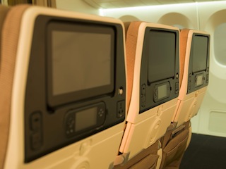 At 18.95in-wide with a 31-32in pitch and 6in of recline, it is a comfortable economy seat, complemented by the 11.1in IFE system with noise-canceling headsets and magnetic jacks, and a bi-fold tray table. The economy experience is enhanced by the luxury bathrooms, which feature a custom-designed sink, pleasant lighting, a full-length mirror and champagne gold detailing.
Adam White of Factorydesign says of the decisions in economy: “There is a lot more to define the experience than seat pitch. Etihad recognized its commercial imperatives on one hand, and what manufacturers would do on the other. They invested an enormous amount of time on the whole main deck, rather than just investing in an innovative seat. Those things lift the spirit and make the journey better. With the main deck entranceways, the first and last thing they see is something innovative.”
For anyone planning to fly Etihad on a route not served by an A380 or B787, the good news is that in the second half of 2015, the airline is retrofitting the fleet with the latest products, beginning with the oldest aircraft.


