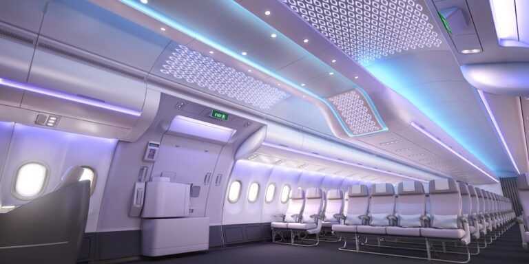
The recent Aircraft Interiors Expo (held in Hamburg, Germany, on April 5-7, 2016) provided the perfect opportunity for Aircraft Interiors International to catch up with Airbus’ vice-president of cabin marketing, Ingo Wuggetzer, and take a tour of the new A330neo interior mock-up. And where better to start than at the entrance? The welcome area at Door 2 of the A330neo features a new illuminated LED panel offering up to 16.7 million possible color variations, enabling airlines to define multiple scenarios and reflect their branding. This can be combined with a Gobo projection lighting option that illuminates adjacent monuments, such as the galleys and lavatories. “The LED ceiling panel and the projection technology create a unique impression that the passenger will remember,” enthuses Wuggetzer.
Airbus has also paid a lot of attention to defining the cabin architecture so as to create a more airy and spacious entrance. “Take the cabin lining around the door: this used to include a pelmet, but we have completely removed it so we now just have the curve of the ceiling panel running right up to the door,” says Wuggetzer. “So when you board, the space opens up right away, giving each passenger a clear view of the new welcome area and lighting feature. It’s just a little thing that we changed but it gives a much broader impression when first boarding, providing a better welcome, because the space opens up much more efficiently.”
Good hygiene
Once I had finished marveling at the light show and flat, bin-free ceiling above the entrance, my next stop was the new, improved lavatory, which will be available in a range of wheelchair-accessible configurations to suit individual airline requirements. A combination of new LED lighting and a softer and more rounded trim and finish design creates a spacious and contemporary feel. The introduction of an antibacterial coating to certain surfaces in the lavatory is highlighted in the mock-up by some rather intrusive stickers – a necessary evil in a bid to soothe passengers worried about health and hygiene on board. Other options included with hygiene in mind include touchless flushing and taps, while discreet aroma dispensers and soothing, ambient sounds are included to further de-stress travelers.
“Regarding hygiene, it’s actually more of a perception problem than a reality,” says Wuggetzer. “Hence we have applied an antibacterial coating, but we had to make it visible by way of a design element that indicates anything painted in that color is antibacterial. This is something our designers are working on, to decide how to communicate this message easily. We’ve also really tried to work on the passengers’ senses by adding sound and mood lighting to the lavatories.”
Bags more storage
Another big visual change from the classic A330 is a new outer/lateral overhead bin design that provides a 66% increase in capacity, allowing five cases to be placed in each four-frame bin. It’s not just passengers who will benefit: the bigger bins should reduce boarding time and crew workload as more passengers should be able to stow their luggage above their own seats.
The bin doors have also undergone a makeover – with new latches and integrated LED hand/grip rail lighting to match those first introduced on the A350 XWB. Wuggetzer admits creating flowing lines with glowing hand rails is an important design trick: “It gives you a perception of spaciousness; straight and parallel lines together will also always give you an impression of a quality product. You have the same thing in the automotive industry with cars that use parallel lines as a quality feature indicator to underline the precise quality of their manufacture. This is something we believe we can deliver, too.”
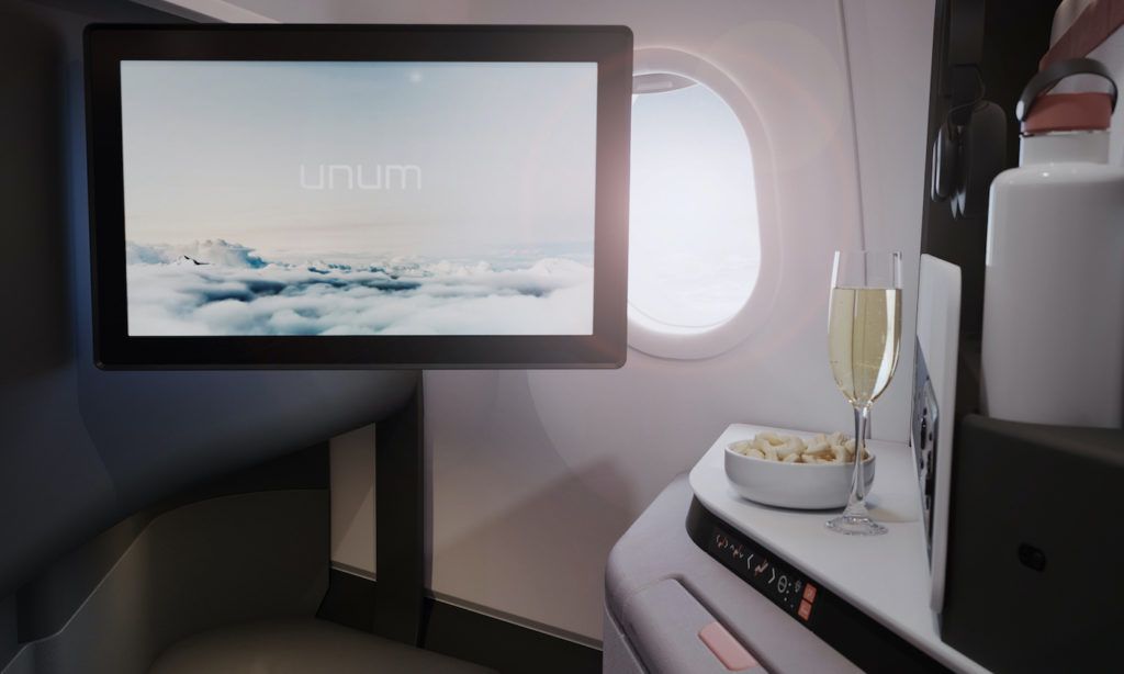
Just like the A350 XWB, the A330neo will feature fourth-generation IFE, with HD screens and discrete electronic boxes to ensure the footwell under each seat remains uncluttered, enabling passengers to stretch their legs. Meanwhile, items including magazine racks, ventilation grilles and window bezels have been upgraded and restyled to reduce cabin noise and increase the sense of space.
Brand designs
The windows are engraved with an Airspace by Airbus logo – a little detail that provides a big clue as to the importance Airbus attaches to its new cabin brand. “It’s a very subtle application of the brand name in the product itself,” explains Wuggetzer, who despite wanting to ensure the cabin remains a flexible canvas onto which an airline can project their own brand, also believes there is room for a much stronger OEM identity within the cabin.
“We want to help the airlines to tell their passengers about the DNA benefits of an Airbus aircraft – the quietest cabin in the sky and the 18in-wide seats in a 2-4-2 economy configuration,” he says. “This will always be the case, no matter what brand you apply or what seat manufacturer you select as an airline. We want to have Airbus features that create a clear differentiation for the passenger and this is something we want to promote and something the airline will want to promote directly to passengers as well.”
Room with a view
Unlike Boeing with its 787, Airbus has eschewed electrochromatic window shades in favor of simple, manually operated shades in the main cabin. “Our solution is quite a practical one; just a plastic shade, but it works and it’s completely dark,” says Wuggetzer. “We did discuss the same technology with our customers, but it turns out this was one of their lowest priorities that they were really ready to pay for and wanted on board their aircraft.”
Greater overall passenger seat pitch has been achieved, as well as greater recline for the seats in front of the ‘smart’ lavatory monument, although airlines may decide to install up to 10 extra seats instead, at the same comfort standard as before. “Our efficiency enablers allow more seats to be accommodated without compromising passenger’s space and comfort,” says Wuggetzer. “Moreover, compared with today’s A330 layouts, if the same number of seats are used in combination with the efficiency enablers, then an increased seat pitch can be realized on the greater usable floor space.”
Finally, the flight crew rest has been relocated to the lower deck to free up space on the main deck for additional passengers. It can accommodate two separate bunks for pilots and six bunks for cabin crew, and comes complete with new padding and mattress materials, enhanced lighting and an improved heating system.
White lines
Despite some clear similarities to the A350 cabin, Wuggetzer is wary of direct comparisons: “Yes the design language we developed was inspired by the A350, but we have had to apply it to a different cross-section and introduce some very different elements,” he says. “It’s very much a new cabin and certainly not a copy and paste job. However, the design language or DNA for both aircraft can be defined in terms of straight lines, very clean surfaces and soft shapes.”
One feature that Wuggetzer is particularly fond of is the color of the components that make up the majority of the cabin lining and interior surfaces. A fresh, clean, almost dazzling white adds a strong sense of modernity, banishing the more familiar vanilla to the history books. “We wanted a color that gives a contemporary design because it will help the cabin age better; the basic elements of the architecture that we deliver need to look modern and fresh for the next 20 years,” he says. “We wanted one standard color that, in combination with the mood lighting, will help to create that perfect color that matches your brand.”
Of course no color or finish worth its salt can go without its own name these days – and this particular shade has been christened Jana White. “I’m not sure if I should tell you this story, but it came from the name of the daughter of the designer who created it,” reveals Wuggetzer. “What can I say, we like to keep things in the family.”
Supply and demand
So who will be supplying key A330neo interior components? “At this stage we can’t disclose a precise breakdown of our suppliers, which are being carefully selected according to their engineering and industrial competence,” says Wuggetzer, although he admits “all the big interiors suppliers are in contention”. These big suppliers are thought to include both Zodiac and B/E Aerospace, and it is likely the program will feature a dual-source supply strategy, although Wuggetzer was not able to confirm precise details. “As a matter of course we build-in contingency in our development planning,” he says. “Some components are in double sourcing and we manage this aspect carefully; however, we can’t disclose a precise breakdown.”
Overall, Wuggetzer can’t hide his paternal affection for the new design upon seeing it realized in the flesh for the first time by way of the mock-up: “I’m really impressed – it looks even better than the renderings and the movie because it really conveys that sense of extra space.”
Anthony James is editorial director at UKIP Media & Events, publisher of Aircraft Interiors International
Click here to read more about the new Airspace by Airbus brand in the June 2016 issue of Aircraft Interiors International
Tuesday 7 June 2016


