As transatlantic business travellers find themselves being seduced by an increasingly attractive range of new products, Virgin Atlantic’s Upper Class offering is showing a few signs of age following a decade of service. Something new, something more glamorous, something more fun was needed to turn the heads of business-class flyers. Following a facelift and thorough workout, the Upper Class cabin has emerged reinvigorated, more refined and lighter.
An aperitif
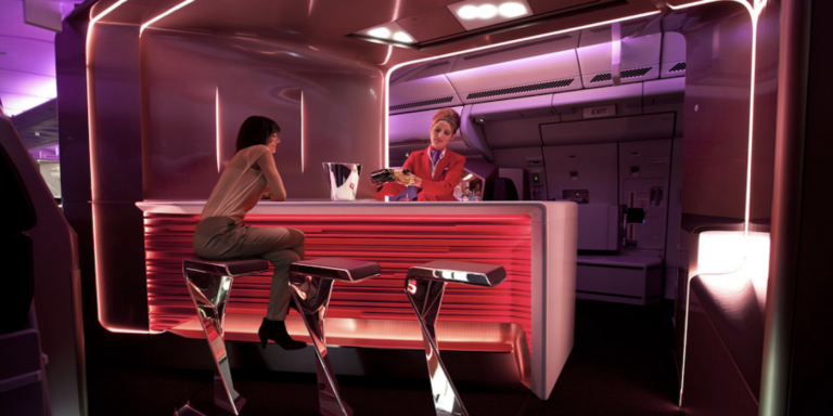
 Many good stories begin with a trip to a bar, and hopefully this will be no exception. The success of Virgin Atlantic has a lot to do with its brand image as a stylish and glamorous flying experience. It’s fitting, then, that upon stepping aboard the airline’s fresh fleet of A330s all passengers are greeted by a striking new bar, which plunges you into the brand’s ethos, with its Virgin red frontage etched in a ‘Jetstream’ pattern. It’s a great introduction, whether you’re turning left into the Upper Class cabin, or right into the economy sections (having seen what you could have had, had you upgraded your ticket).
The 2.7m-long bar is marketed as the longest in the sky, but that superlative is the product of function, not marketing. To seat three passengers, with the bartenders able to reach the ends of the bar without risk of spillage, this length was required. The bar structure also houses storage areas for a range of equipment and supplies for the ‘mixologists’, and spirits and magazine storage are left exposed in diamond-shaped cutouts, while the new champagne coupe glasses are shown off to their best effect in illuminated racks.
This area came under the purview of senior designer Gareth Southall, who came up with an initial design, which he then refined together with design experts from London-based architecture practice Voon Wong + Benson Saw (VW+BS).
“The bar is one of the areas we really invest in and will continue to invest in; it’s the first impression. I think even people going to the back to economy appreciate the fact it’s on the aircraft and they will talk about it, whether or not they use it,” states Southall. “It’s all about the brand experience and interaction. For people who do come into Upper Class, it’s very much a welcome encounter similar to being greeted in a hotel.”
The bar area is much brighter and more inviting than the previous design, especially as it is now set at a more sociable orientation. The bar is wrapped in a champagne-coloured canopy, in which several slashes house lighting systems developed with DHA Design that pour light into the bar area and bathe it in a range of colours. These slashes are orientated so the light is focused on the bar, not on the seating areas. This is especially important as seats 8A and particularly 9A are virtually in the bar area but the occupants need to feel part of the Upper Class cabin.
“The lighting can be changed depending on the time of day or the route – for example on a New Year’s Eve flight to Las Vegas we can give it the full works. Or we can have a more domestic feel so it’s relaxing. Mood lighting makes a big difference to the passenger,” says Southall.
The light reflects off a glossy bar surface made from a bespoke glass-reinforced aggregate. When manufacturing the surface material, the glass fibres were allowed to float to the surface, adding sparkle and helping to hide any scratches. The bar feels remarkably solid and stone-like (it is even cold to the touch), even though the surface is a mere 4mm-thick.
The three bar stools look fantastic, a twisted chrome cantilever design topped with aubergine leather. The cantilever design was a real challenge for certification, says Southall, but the result is worth it (and indeed worth the US$40,000 they each cost). Other guests can lean on the bar or stand in the area behind. On Beauty Queen’s inaugural flight from LHR to JFK we managed to fit 13 people into the area, although the official limit is eight. A V-shaped bar with the bartender in the centre may have seated more guests, as with the previous design’s five-seater arrangement, but the welcoming factor demanded the current shape, as did a clever new seat configuration. Which brings us to…
Dream suite
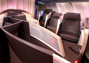 Enter the Upper Class cabin and everything will look familiar to regular users, just a little refined, with calmer colours and lighting, and Swarovski crystals adding a little bling. The feeling of space is certainly helped by the omission of overhead lockers in the centre, as before. However, a major change is the configuration: the 1-1-1 layout used on Virgin Atlantic’s A340s has given way to a 1-2-1 layout in the same cabin width of 5.28m.
The new layout was the brainchild of senior designer Nik Lusardi. “It was one of those ‘Eureka!’ moments. We were working on the seat as a team and had six or seven ideas. We were working on different configurations and knew the herringbone was the holy grail of space efficiency as everyone gets aisle access and their own suite and we can get a good length and width in the seat. But we weren’t sure how to improve the existing product so we did a lot of renderings and finally worked out a way to get four abreast on a small wide-bodied aircraft. The fundamental of the design is the offset, combined with a different pitch and angle, so we can have four abreast next to each other.”
The design, codenamed Uri – “It’s great for space,” explains Lusardi – enables not only an additional three seats to be fitted in an A330 (33 versus 30 in the previous design), but also a longer bed and wider seat, and the larger bar area. “No one believed me when I first showed them the new design,” reveals Lusardi.
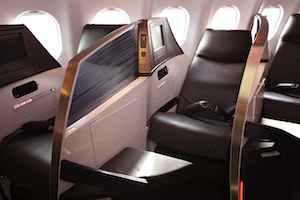 The suite, nicknamed the Dream Suite and assembled by Threesixty Aerospace is noticeably curvier than its predecessor, with the curves sweeping away rather than being parallel, which adds to the feeling of space in the cabin, as well as physically adding shoulder and midriff space within the composite walls, without losing any cabin space. A new opaque shield also helps break up the suite walls.
“The curves not only look great and give you a greater sense of space, but the aesthetics were created by the need to create space. The wall moves away from you in a twisted helix, which gives you a feeling of space – you don’t get the MRI scanner effect,” says Lusardi.
Four design agencies were invited to develop the design, and Pengelly Design won with its vision of the shapes and curves and shield design. Nine months into the project an unexpected hurdle was encountered when Boeing announced delays in the delivery of the 787 – the aircraft the design was originally intended for. “We had to flip the project on its head and work out how to take it off the 787 and put it on an A330,” explains Lusardi. “The 787 is wider and the sidewalls are straighter, which makes a huge difference. It was a major tweak to make it fit because of the cause and effect: whatever you changed affected something else. All the unique features we had developed had to be altered and remain commercially viable – it was really challenging. Some things got lost – for example, a dual armpad on the original concept wouldn’t work with the packaging [only a single would fit], but on the 787 they’ll be brought back. Also the ottoman was made a little smaller.”
Gone is the bright purple leather(‘aubergine’ in Virgin Atlantic’s colour palette), replaced by ‘espresso’ brown leather for a calmer feel, with the ottoman base wrapped in ‘black cherry’. The curves in the seat also enable an additional 1.5in seat width, bringing it to 23.5in, which gives more room to the waist area when sleeping, and a longer bed at 87in, although the centre seats come in at 80.3in. The seat also reclines by around an extra 50% over the previous design to bring it closer to the ideal ‘lazy Z’ in what the airline calls the ‘super lounger position’.
Story time
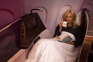 The bed function remains familiar, requiring the passenger to stand up and press a button for the seat to return to upright, waiting for the ‘click’ when the mechanism is unlocked, pulling the headrest down so the seat is flipped to its sleeping surface, and giving it a final push to lock it in position. A push on the bed is required to unlock it and reverse the process. A full-electric mechanism was discounted for reasons of weight and consistency of product across the entire fleet. “This design is just as intuitive to use [as a full-electric system] but reduces weight. The passenger intuitively knows what to do with the bed and it’s simple to use – and nine times out of 10 the crew will prepare the bed as part of the service anyway. It’s a balancing act between aesthetics, engineering and the customer experience,” says Lusardi.
As the supplier of the seat, Martin Barnes, managing director of Threesixty Aerospace, was heavily involved in the engineering. “It’s more of an evolution than a radical change. We tried to keep the same ethos so its still a lie-flat seat, still uses flip technology, but visually it looks very different,” he says. “What we tried to address with this seat was to improve sleeping comfort and some of the maintainability issues of the old seat.”
Suspend belief
As well as now offering the longest bed in business class, Virgin Atlantic also wanted the most comfortable. Key to achieving this is a new hoop-supported webbing system which means the seatback doesn’t have a hard surface – both the sitting and sleeping surface are on a webbing that gives a flexible sleeping surface.
“This innovation has never been done on an aircraft before. There are other suspension systems out there, but nothing like this,” asserts Lusardi. “This is brand new and actually comes from the furniture industry. We’re really proud of this and can put our hands on our hearts and say this is a really comfy bed – probably the comfiest bed in the sky.”
A bespoke elastomeric system, manufactured by Dahti using similar principles to the Herman Miller office chair, is strung between the load points of the seat and tunes itself to each passenger’s weight and stature. The seat had to be engineered for greatly increased strength over the previous version, as around 40 lb of pressure is exerted on each point of the frame when empty – far more when it is occupied.
“This was quite an engineering feat and it was all developed from the ground up,” says Barnes. “We tuned the tension on the webbing membranes to make sure we got the best comfort quality. Dahti works in a task chair environment and the process they use is that the webbing membrane is injection moulded and they can adjust the tension for the best passenger comfort. There is no pure science in ensuring comfort – by adjusting it and trialling it we get the best comfort we can.”
To be sure, Lusardi consulted with a number of ergonomists to measure comfort levels, and conducted line trials with some top-rated Flying Club members. Some of these regular flyers even slept overnight on the beds at Virgin Atlantic’s mock-up centre near London Gatwick for a full-service ‘flight’, and gave their feedback. “When you’re working very closely with something it’s difficult to take a step back and be objective about the different options so it was good to get that feedback. We got some really interesting comments and we took those on board,” says Lusardi.
A bespoke ‘3D Nomex hexmaterial’ fabric on the sleeping surface aids sleep, as does the cabin crew’s recent coaching to speak to passengers at 20-30dB during night flights.
Certification
The Uri layout is good for comfort and should be good for revenue. However, it has not been without practical problems. To make it all fit, the aisles have narrowed, making it difficult to wheel a cabin bag without hitting an ottoman, and bed length in the centre suites has been sacrificed. However, the team faced bigger problems.
Certifying those centre seats was probably the biggest challenge as there was a potential load share condition between the seats whereby the load from one seat could be imparted on the shield perpendicular to it. To solve this, a ‘frangible fuse’ was built into the rear screen so that in the event of a loading the shield would bend so no load was imparted on the seat in front. This design passed all tests and has been approved by Airbus and Boeing.
“It’s a novel approach and we’re the only people to have done this with an interlocking concept down the centre section,” explains Barnes.
A further design change was that the composite suite walls, while looking like one piece, have been split into two sections with a thin split line. The rear shield is seat-mounted underneath through integrated metal structures, and the forward shield is a separate structure, enabling them to be certified separately – the rear to 16g, the front to 9g. This also means that in the event of damage to the forward shield, it can be replaced in around an hour while the aircraft is on the tarmac.
Overall
Getting more passengers on board while adding to living and social space is a great achievement, especially as the new seat is actually around 18% lighter than the previous version, at 100kg. The certification process added a little to the seat’s target weight, but Threesixty Aerospace hopes that by the time comes to fit out the 787s they may be able to remove a little more weight, especially in the tray table assembly.
Three of Virgin Atlantic’s fleet of A330s have been fitted with the new Upper Class product, with the remainder due for completion in September 2012 and the A330 retrofit program due to be completed by the second quarter of 2013. The remaining fleet of 747s and A340s will not be upgraded; instead the airline will be focussing its efforts on making the Dream Suite for its 15 Dreamliners, due for delivery beginning in 2014.
