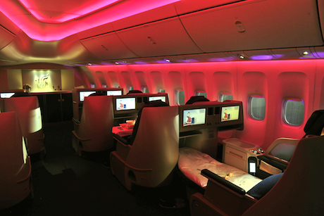
Air China’s latest interiors project is a special moment in aviation. It is a Boeing 747-8i scheme, sadly a rare sight as Lufthansa is the only other airline flying the intercontinental Queen of the Skies. Even more special, the seven aircraft in the fleet will have interiors that incorporate traditional Chinese art to tell a story in which the passenger is flying through the clouds, carried on the wings of the phoenix flying high in the sky.
The airline commissioned Chinese artist Han Meilin to create the artwork for the interiors. Han was a particularly good choice, as in addition to being an artist of no little renown in China and around the world, in 1988 he designed the airline’s logo, which cleverly combines a phoenix with the letters ‘VIP’.
Air China also brought in JPA Design to collaborate with Han, to translate his work into the aircraft interior. This isn’t the first time that JPA has worked with Air China, as the firm has designed lounges, and a partial interior scheme for the airline’s B777s launched in 2012. There wasn’t time for a complete scheme on the B777s, but as the B747 design work began in late 2012, there was time to perfect the complete scheme for the B747, which ties in with the lounges for a seamless transition through the Air China experience.
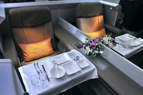
We spoke to Sim Kim Chui, product innovation director at JPA’s Singapore office, and the studio’s lead on the Air China project. Prior to joining JPA, Sim was VP of product development at Singapore Airlines, where he worked for nearly 20 years, so his cabin design credentials are impeccable. He explains how the studio collaborated with Han: “Air China brought Han in and he was responsible for coming up with the Chinese culture elements, while we put together the cabin scheme, incorporating those elements. Air China wanted something that reflected Chinese culture, but with an international feel.”
This international feel is important for routes such as Beijing to New York, but as Sim says, “In some ways this was the most difficult part because you have to strike a very good balance.”
Han created artwork specifically for the Air China interiors, including a phoenix in flight and a divine cloud, creating soft, dream-like images in a calligraphy style. The patterns depict three traditional Chinese cultural elements – beautiful clouds, pottery pieces and the auspicious phoenix – which represent heaven, earth and flight respectively, conveying the message that heaven, the land and man are in perfect harmony in a peaceful and happy world.
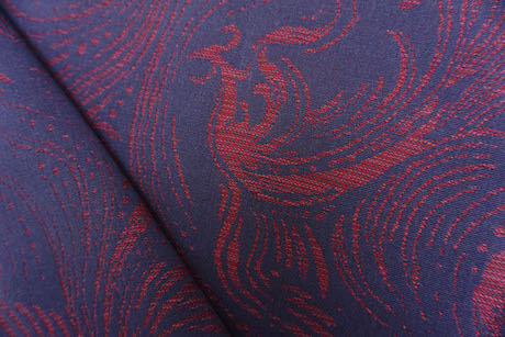
However, it was not a simple case of printing and stitching that art on to various textiles and laminates. This is where JPA’s aviation design expertise was crucial. “Han painted a few hundred artworks, but only a few were shortlisted for us to experiment with. We selected those that we thought had a good balance for that international feel, and those that worked well with the colors we had in mind,” explains Sim. “Some of the calligraphy-style phoenix designs cannot be replicated well on a fabric, because on a fabric the pattern has to be repeated. Some of the designs have a lot of empty space, which also didn’t work out well. The weaving process, by its nature, may not be able to capture the dynamism of the phoenix.”
However, after many modifications the artwork was finalized, with styles and scales appropriate for cabin materials. The textiles feature the artworks in different scales between the seat fabrics and soft goods, and in different colors throughout the aircraft, from first, to business, premium economy and economy. “The idea is that you don’t see the same design everywhere, but you can see that they are all from the same family.
There’s a theme that runs through the whole aircraft and we emphasize different aspects of the design for different finishes,” explains Sim.
These scales meant that sometimes only part of the phoenix was used, so while the creature features hundreds of times throughout the cabin, passengers will keep discovering the bird as they walk through the cabin during the flight.
For example, the pillows and antimacassars are printed with just a part of a phoenix, reproduced at a larger scale than on the seat covers. The decisions were made after considering the size of the cabin and its seating products. “There was no hard and fast rule. We just made sure that when you look at everything in combination it looks good,” says Sim.
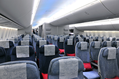
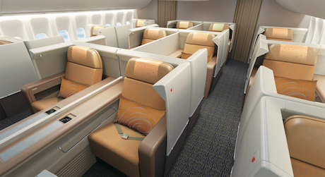
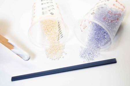
JPA briefed the fabric suppliers (Lantal and Botany Weaving) and gave them the artworks to reproduce in the seat fabrics, carpets and curtains, together with specifications of colors and weave. Similar specifications were given to the laminates suppliers (Schneller and Isovolta), and to Teague.
Getting the patterns just right was a painstaking process that took several months. “Due to some limitations in the weaving process, Han himself wasn’t satisfied. However, he understood the limitations and he adapted his designs so we can get that perfect result,” recalls Sim.
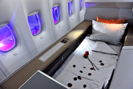
From April 2011 to launch in October 2014 seems like a long time for a CMF project. Indeed it was longer than Sim expected, but as he explains, Air China was very thorough. “We built a full-size mock-up cabin complete with seats and lighting for them to test out two different schemes. They brought in management, staff, passengers and the media, and the final choice was a democratic selection.”
Whether by democratic selection or divine intervention, the Air China jumbo will certainly give passengers a happy and harmonious flight, under the watchful gaze of the phoenix.
Meanwhile, back on Earth
Air China has also completed airport lounge projects in Shanghai and Beijing. The Shanghai lounge is set over two floors, with a 20,000ft2 space for business passengers and 7,000ft2 for first class.
The lounge designs reference Air China’s brand colors and specially commissioned patterns by Han Meilin, again blending Chinese heritage with an international feel.
The first class lounge in Shanghai and the Air China Lounge in Beijing feature articulated curving timber screens to separate the dining and bar areas from the quieter, more relaxed lounge areas while also creating a sense of privacy and exclusivity.
The lounge projects were designed by JPA Design. Sim Kim Chui, product innovation director at JPA in Singapore explains, “Air China wanted a very coordinated look, so it wanted the lounge to be a very similar experience as in the new aircraft cabins. Some of the cabin elements are used on the ground, such as the divine cloud and terra cotta design.”
Business bubble
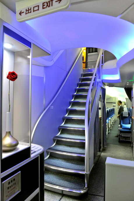
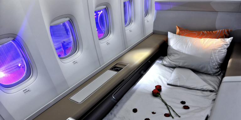
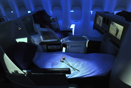
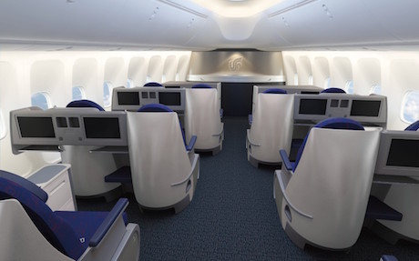
Air China’s B747-8i has a slightly unusual configuration, with its 12 first class seats located not in the nose, but behind business class. This allows the luxurious Venus seats from Zodiac Seats UK to be fitted in, while also giving the 24 business travelers in the nose and the 30 in the upstairs bubble a real sense of occasion as they recline in B/E Aerospace Diamond seats. Behind first class is a premium economy cabin featuring 66 Star Plus seats from B/E Aerospace, and behind that the economy cabin, accommodating 233 passengers – again with the Star Plus seat.
The Han dynasty
Mr Han Meilin’s first work with Air China was back in 1998, when he was commissioned to create a corporate logo for this new airline. Given that the phoenix symbolizes beauty and auspiciousness, happiness and harmony, as well as flight, the phoenix was always a strong contender for the logo. However, Han was particularly inspired by the head of a Han dynasty (206BC-220AD) bronze stick unearthed in Jinning’s Shizhai Mountain in Yunnan, on which a number of parallel lines had been turned into a phoenix pattern. Han made the parallel lines into not only a phoenix pattern, but the letters ‘VIP’. Chinese red was selected as the logo color, as in Chinese culture it implies auspiciousness, completion, peace and happiness. The logo is applied to the tailfin of the Air China fleet, with the fuselage including a Chinese flag and the airline’s name in English and in Chinese calligraphy, written by former national leader Deng Xiaoping.
