Sleep is the new black. So said United Airlines’ president and CEO, Oscar Munoz, as he unveiled the new Polaris business class seat in New York. He went on to describe the product as “defiantly innovative”, “breaking the mold” and a “reimagining” of its international business class. Bold ambitions and bold claims, but are they marketing puff or truly “the most significant transformation of the product in over a decade”?
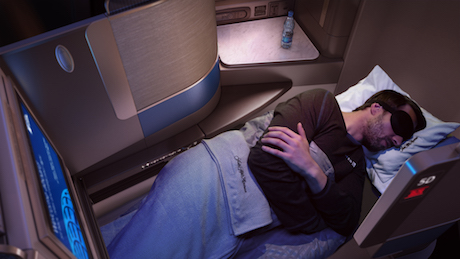
For years, United knew it had a problem: the quality of its business class offer was being surpassed by rivals. Inconsistent seating product – some with fully flat beds, some without – and awkward step-overs for passengers accessing the aisle during the night were becoming a less appealing prospect for customers. Seeking a solution, the airline conducted more than 12,000 hours of interviews with business class customers about what they valued most in international travel, and the overwhelming response was a good night’s sleep – indeed it was deemed almost 2.5-times more valuable than other premium comforts such as dining and VIP accoutrements.
With this in mind, Munoz explains that a seating product that puts sleep at the center was clearly required: “We want to make the weary traveler a thing of the past.”
Meanwhile, in a studio in London’s Farringdon district, a team of industrial designers at Acumen had been developing something they knew was special: a unique, super-efficient seating layout. So confident was Acumen in the concept that it had invested huge resources into developing an initial sketch in a notebook into a globally patented design.
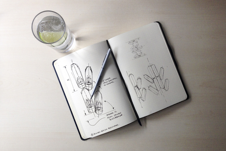
The design was waiting for the right customer, and who better than an airline with one of the world’s largest wide-body fleets? United had been talking to a number of seat manufacturers about new product – a big deal as this is one of the largest orders for business class seating in the history of aviation – but while product existed that would have given United customers that all-important sound night’s sleep, they all had too steep a price for the airline: a loss of cabin density.
Acumen’s solution, however, was what the team calls “density neutral”, giving United all the comfort features it wanted, and that coveted direct aisle access, without any reduction in seat count.
During a meeting with the airline, the layout was checked for every wide-body in United’s current and incoming fleet – B747s, B767s, B777s, B787s and A350s – and the figures stacked up for every cabin. The result? A standing ovation from an impressed United team, according to Acumen.
So what’s the secret?
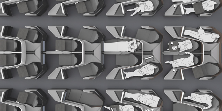
“What makes this layout unique is that it combines an in-line seat and angled seat as a pair. All the aisle seats are herringbone-like at an angle, but the center doubles and window seats are all in-line,” explains Ali Ersan, an associate at Acumen.
The layout – which the team refers to as “herringline” – is claimed to offer an advantage over staggered layouts in that it eliminates dead cabin space, maximizing use of the world’s most valuable real estate.
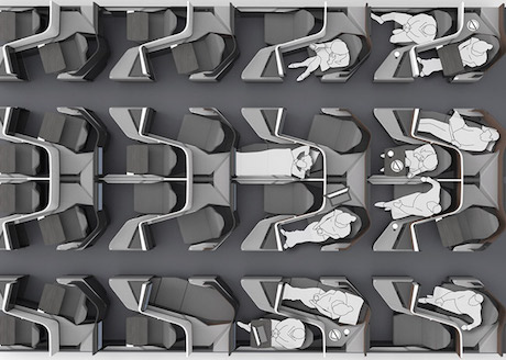
The layout also offers an advantage for the passenger experience, as the stagger gives the 2-4-2 LOPA the feel of a 1-2-1. Polaris is a high-density cabin, but the layout creates a premium feel with real privacy in every seat – unless those in the center pairs wish to lower the electric divider for a shared experience.
“It’s the holy grail,” enthuses Anthony Harcup, an associate at Acumen who was also lead designer and co-inventor of the Etihad A380 first class cabin.
There’s no doubt the layout is great, but the grail? Couldn’t the different experiences offered by the in-line and herringbone seats present an issue? Far from it according to the team, who say that research has actually found the differing offer to be an advantage for United. “One seat type isn’t better than the other – they both offer distinctly different advantages for different types of passengers. United did research and found the passenger preference for each was split 50:50,” states Ersan.
Thus United has embraced the customer choice offered by Polaris, and the design team – together with Zodiac Seats UK, the seat manufacturer for the project – has made sure the in-seat experience is equal, with a little extra bed surface area and larger side furniture for center seats for a greater feeling of space, and a larger backshroud for the aisle seats so that the occupants can enjoy similar privacy to those in the window seats. But let’s not forget the most important leveller: direct aisle access for every passenger.
“It occurred to me this project is the perfect storm. It’s the most efficient layout. In terms of airlines, United is probably the best we could have launched this with. In terms of seat manufacturers, Zodiac is the biggest in the world. It’s a heady mixture of influences,” states Harcup.
Herringline becomes Polaris
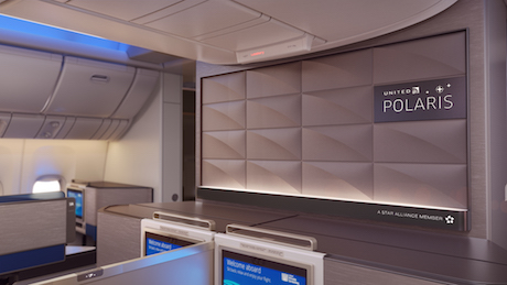
While Acumen optimized the layouts and packaging, United brought in another London studio, PriestmanGoode, to lead the creative direction of making the seat a unique United product – as well as to extend the Polaris brand across the passenger experience, from check-in, to airside, to cabin. Everything from the ice cream bowls to the brand panels are unique – and uniquely United.
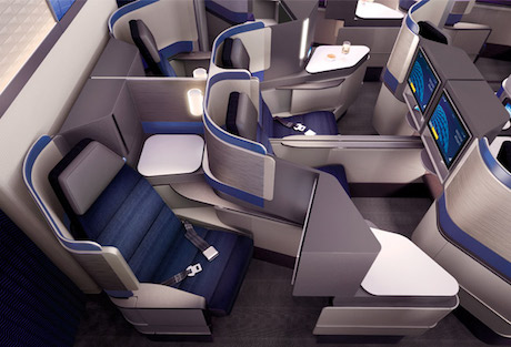
PriestmanGoode became involved in the project early on, when the layout was fully established but the seat design was still in the mock-up phase. This wasn’t just a CMF project for the studio, as it was involved in shaping the seat design and making it fit with its cabin vision, as studio director Nigel Goode explains: “We came up with the vision for the whole cabin interior and the plan of how to implement it.” In other words, PriestmanGoode took Acumen’s clever seat layout and made it a distinctly United seat.
The PriestmanGoode team was keen to ensure that the interesting configuration didn’t become a dull reality, swathed in large expanses of plastic: such a major project deserved something special. However, implementing that plan was no small task, given the breadth of the United fleet. Every LOPA required a discreet change in the use of colors, materials and finishes to break up surfaces, and as Maria Kafel-Bentkowska, CMF lead at the studio, explains, “We knew we couldn’t implement the whole vision on some aircraft types, so we created a scheme that means we can do variations on the design to fit each aircraft. It’s not a simple copy-and-paste project.”
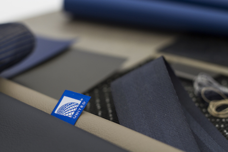
The rather bland outgoing blue cabins will be replaced by a more carefully considered and varied mix of blues and grays, applied in clever ways to maintain visual interest, with a mix of materials and finishes skillfully applied to break up surfaces so that those dense cabins don’t look repetitive.
Of course sleep, that key driver of the Polaris project, was given a lot of attention. The PriestmanGoode team strove to make the sleeping environment as private and calming as possible, including a dimmer for the lighting and soft panels behind the passenger for sound deadening and comfort.
The PriestmanGoode and Acumen teams got to know each other pretty well, with the differing dimensions of each aircraft type presenting their own challenges. For each variant, Acumen would optimize the LOPA, and with that in place, PriestmanGoode would apply the United brand as well as make adjustments to elements such as stowages and lighting. The range of suppliers across the aircraft types also created challenges, requiring Kafel-Bentkowska to work hard to ensure consistency in finish and color.
“This isn’t like some seats where there is just a left and right version. There are several slight variants in each aircraft and also changes for each LOPA,” says Goode. “It has been one of our biggest challenges and one of the most rewarding jobs because of that.”
To ensure Polaris retains its good looks, PriestmanGoode discussed maintenance with the airline. When some business class seats suffer cosmetic damage to the shells they have to be sanded and painted, or in some cases taken off the aircraft for repair. The team tried to make life easier for United’s maintenance crews by only using foils in low-impact areas, by incorporating sacrificial panels that can be easily replaced, and by using plastics that can be easily repaired.
A similar philosophy was used for the entrance areas, which take a particular bashing from bags and carts, and have been specified with 3D vacuum-formed Kydex panels that can be replaced during a turnaround. Polaris isn’t just a great business class, it could be a major part of revitalizing the United brand. As an emotional Oscar Munoz said at the unveiling, Polaris is, “The new spirit of United. We have a lot more work to do, but I’m beginning to feel a new energy.”
