As head of design at Virgin Atlantic, Luke Miles influenced the entire end-to-end Virgin Atlantic passenger experience, from new lounges, uniforms and in-flight entertainment experiences, to the introduction of the Upper Class suites and bars. He left the airline early in 2014 (details below), but with an impressive legacy of work, we took the opportunity to ask him his views on how to improve the journey.
What do you see as the key elements of the onboard passenger experience?
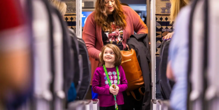
“When you board the aircraft, there is a moment when you need someone to point you in the right direction. The greeting is very important from a service perspective.
“Once in their seats, people develop their space, whether they are in economy or Upper Class. Even in a tube, people create personal space through body language. They create space and develop it over time and it becomes a sanctuary. Airlines need to encourage that. The new Wander Wall in the B787 premium economy cabin creates a space for people to be sociable, and then they go back to the space they own.”
What elements need to be developed further?
“There are psychological moments from a comfort perspective in the various stages of a journey, when passengers transition from one state of mind to another. When coming in to land, your mind is already disembarking you’re remembering where your bag is and working out how to get off the aircraft. Those segways between what the customer is experiencing and the protocol of service onboard could be handled more cleverly. Dialling into that element is critical. It shouldn’t be just a standardized step-by-step approach of when to do things, it must be more fluid. Think of the aircraft as a stage and you need to work out the choreography of people through that space on a psychological level.”
Can you win hearts and minds through the stomach?
“You need to consider food, and what food means to the experience. In expensive cabins there is sometimes a silver service notion, which is a bit old-fashioned. The service should have a less structured feel, and feel more like you own the space you are paying a premium for. That might mean engaging with what you are eating or drinking in a more meaningful way. Virgin’s Wander Wall is a nod to that idea, but there’s a lot more that can be done in that realm.”
And of the service itself?
“It is nice to split meal service so you are not stuck with a tray even in economy. And as the crew remove each part of meal service, that gives customers a moment to interact with the crew again.
“You want more flexibility, especially in a plane. You want fluidity, to be able to eat whenever you want. However, that fluidity means the quality of the food has to be better if the service is more fluid. If you go to a wonderful hotel, you can have exquisite service or you can be slightly more free. That’s the challenge when people want to be more free, then how do you maintain quality?”
Left: Miles headed up the design of the first-generation Upper Class cabins for Virgin Atlantic’s Boeing 747s
How do you see IFE developing?
“Digital content is changing dramatically, due to personal electronic devices and pre-loaded content being brought onboard. This is a huge challenge in terms of how fresh the embedded IFE content might feel. Content is getting ubiquitous, so embedded content needs a fresh feel.”
In your work with airframers, did you find them open to innovation?
“There is always tension as they fear that customization might mean delay. Boeing has improved the core aircraft architecture, with elegant lighting, a clean aesthetic, and advances in window design and how passengers feel at altitude, etc, so airlines can buy a lovely product straight off the shelf.
“However, differentiation is critical for airlines nowadays. More airlines will be asking for it, and the airframers will have to play to that. In our design work at Virgin Atlantic we had to be sympathetic with cabin architecture and complement it. We also strived to create a consistent design language from noise to tail, to show sensitivity to every class of travel.”
For you, what was a pivotal moment at Virgin Atlantic?
“I was given the opportunity to redesign Virgin Atlantic’s headquarters near Gatwick as it was looking a bit dated. We created a calm, clean white backdrop at the entrance, which meant that the first sharp interface with the Virgin red was with a person in uniform. Likewise, the entrance to the JFK Clubhouse is a white tiled backdrop for the staff in their red uniforms. A product can be copied, or a rival can catch up product-wise, but people and service are harder to imitate. It’s the culture of the company. Virgin Atlantic is attractive to people with a certain mindset.
“We reduced email to bring in more face-to-face communication, to make people more central to the culture. We brought in ideas such as breakout spaces, and we noticed a cultural shift, with people galvanizing to bring the airline in the direction they felt it should go. It’s a pioneering company with a problem-solving spirit.
“Part of that project was also the global service. We worked out how to dial up and fine-tune the qualities that people expect of Virgin, and that was end-to-end, from the website booking engine and advertising, through to call centers, the airport experience, Clubhouses, onboard product, and disembarkation. We looked at the whole experience through customers’ eyes.”
How did this work influence the aircraft interiors?
“We found that when people board a Virgin Atlantic aircraft they already know where they are, so we felt the branding could be more subtle. So we made it a blank canvas. We tried to dial down the color and make the environment more sophisticated so the key differentiator of service – the people dressed in red – would resonate more.?
“The environment as a canvas is at the heart of the Virgin Atlantic experience. We had wonderful hardware, but it is the people software that makes Virgin what it is, so we carefully curated several initiatives. For uniforms, we wanted to work with someone who would celebrate the human form and deliver a uniform that matches the service spirit and makes the staff look their best, so we worked with Vivienne Westwood. The uniform has become the epicenter of the red brand color, and we toned down the cabins, so apart from the lighting, there is very little red onboard; the highest dose of that color is through the most effective channel – the people.
“I have a perspective that service is sensorial and almost atmospheric. A failure in a hard point can be fixed, but if the people aren’t right, the experience can be far worse than having a failed seat or IFE system. If the atmosphere isn’t right, it can have a much broader negative effect. The physical elements usually work beautifully; it is the human interface that often fails. When you disembark, it’s the service that stays with you.”
About Luke
Luke Miles may not be a current Virgin Atlantic employee, but he has had a lot of influence on the airline’s products. He first joined the airline in 2000, when he spent four years as a senior industrial designer, involved in the first iteration of the Upper Class Suite, bar and cabin, as well as the new premium economy product.
He then ventured into the world of consumer electronics, with four years at Nokia seeing him rise quickly from senior industrial designer to senior design strategist surprisingly familiar territory, with work including color and material selection, and translating brand values through design. Three years as head of design at LG Electronics followed, again with work involving color and materials, and driving product experiences and design language across a wide range of products.
This experience saw him in good stead when he returned to Virgin Atlantic in 2011 as head of design, leading the creative direction of digital, service and industrial design. This work involved the design and delivery of the entire end-to-end customer experience across multiple touch points, as well as developing the airline’s internal culture, developing employees’ sense of brand values through the design of the working environment, and the activation of recent global service initiatives.
He left the airline in early 2014 to join Territory, a London-based design consultancy, as director. Territory focuses on brand experience, for everything from consumer electronics, to aviation, to digital apps, to high-end motion graphics for films and games, bringing physical and digital service together. For example, the studio created the digital indents for Virgin’s IFE system and the dynamic moving images they display during boarding.
“We look at the emotional ECG,” explains Miles. “There’s a neutral point, and the curve moves from that toward the positive or negative throughout a journey. We look at how to improve the negative. We’re doing some nice aviation work on this now.”
Luke Miles was speaking to Adam Gavine


